I help brands and organisations communicate better
Governance and Solutions
I ensure projects are expressed properly, beautifully and consistently by providing approvals and solutions across businesses and territories, media and touchpoints.
Brand Guidelines
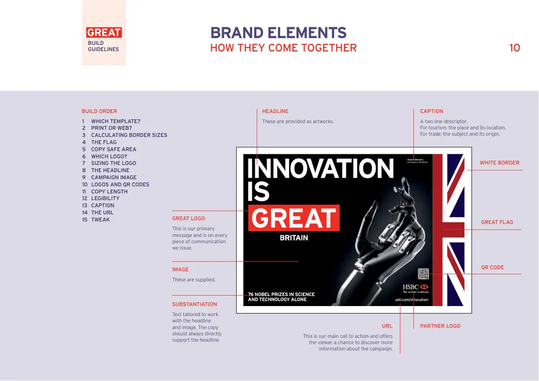
These can include codifying the rules, reverse engineering design, easy to follow sequential build guides, protocols for how elements move and relate in digital environments, and how brand elements work and where.
Concept and Design
My creative skills cover every stage from concept to delivery. This includes strategy and development, creative design and direction, copywriting, and implementation.
Managing Brand Change
My experience across brand and project building, leadership, and guardianship is extensive and on projects that are variously independent, global and local. I've been a brand project design manager, a team leader and a senior designer. Rollouts? So many...
Brands
- HSBC Staff Channels
- Allianz
- La Trobe University
- Gucci
- Dubai Parks
- Britain Is Great
- Bupa
- Public Transport Victoria
- TalkTalk
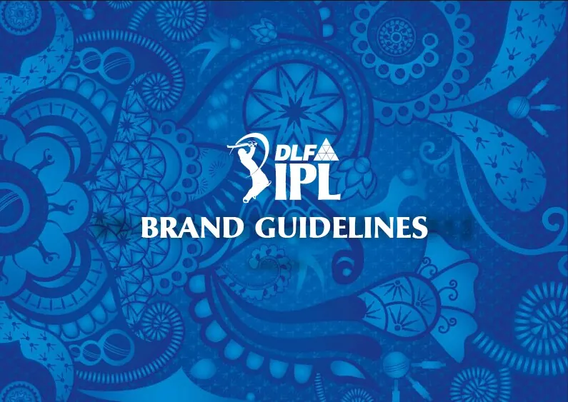
- Indian Premier League
- Tesco
- Sure/Rexona
- Carlton United Breweries
- ITV
Agencies
- Beyond
- Bulletproof
- Cheil
- Corke Wallis
- DesignWorks
- Engine
- Fold7
- FutureBrand
- Grey London
- IMG
- ITV
- Mother
- Siegel+Gale
- Sunshine
- Tesco
- Turner Duckworth
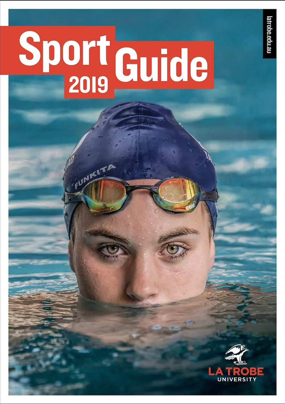
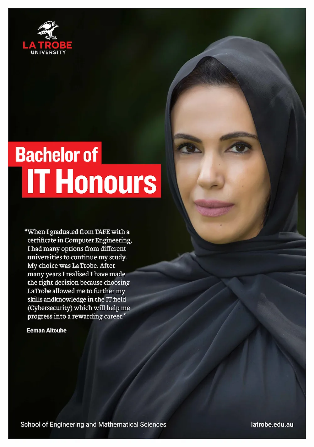
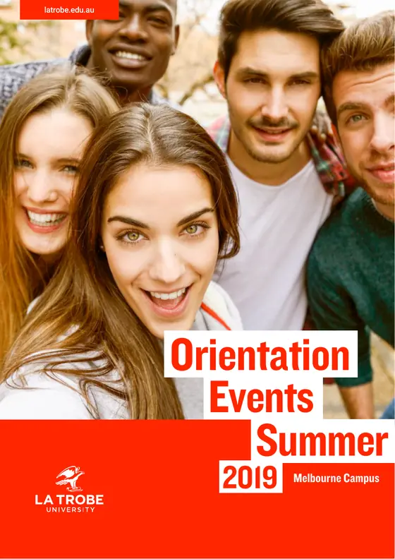
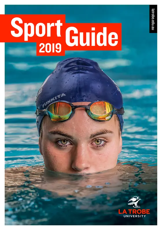
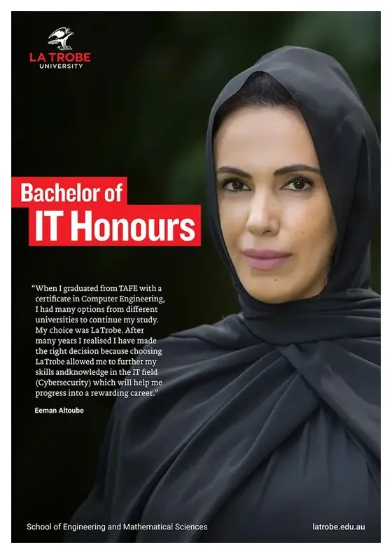
La Trobe University Melbourne
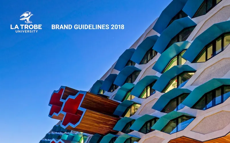
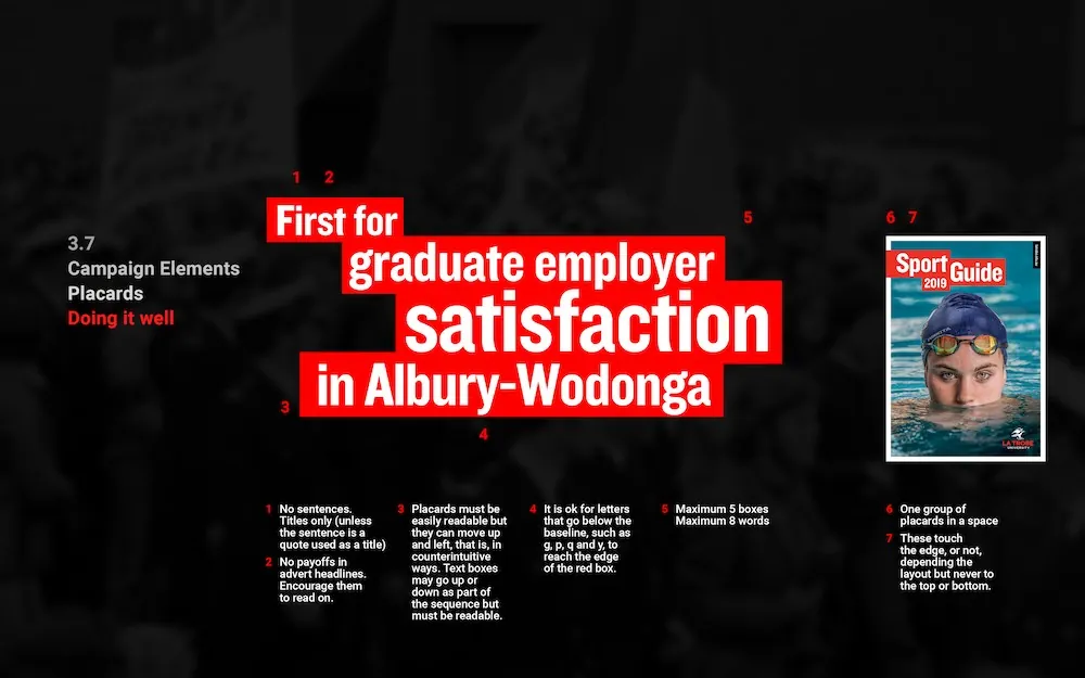
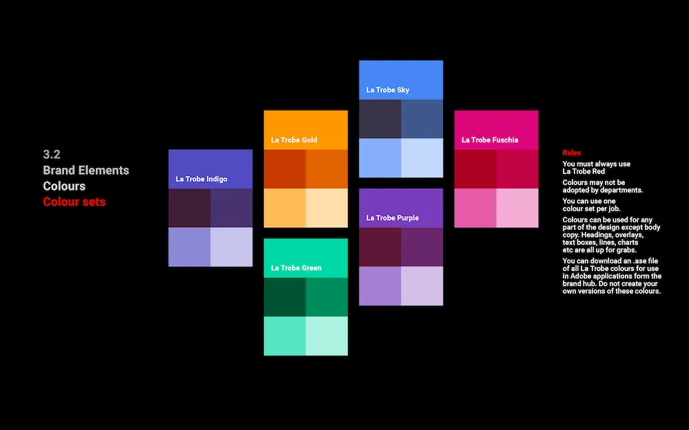
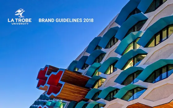
I was brought in to help steer the design, and to develop brand elements for La Trobe’s rebrand project to create cohesion and engagement.
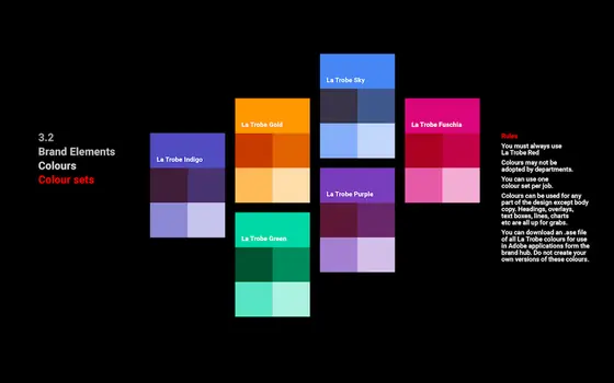
I worked on all aspects - visual, content and messaging - including logo usage, choosing colours and fonts, and developing flexible layouts.
Client: La Trobe University

Gucci / Chime For Change
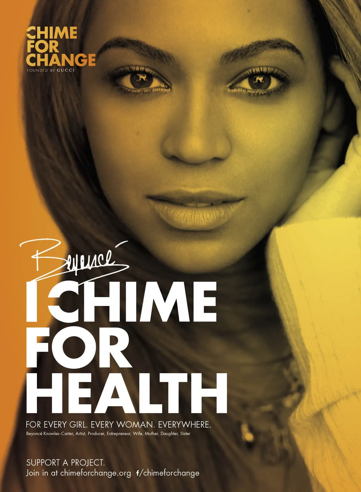
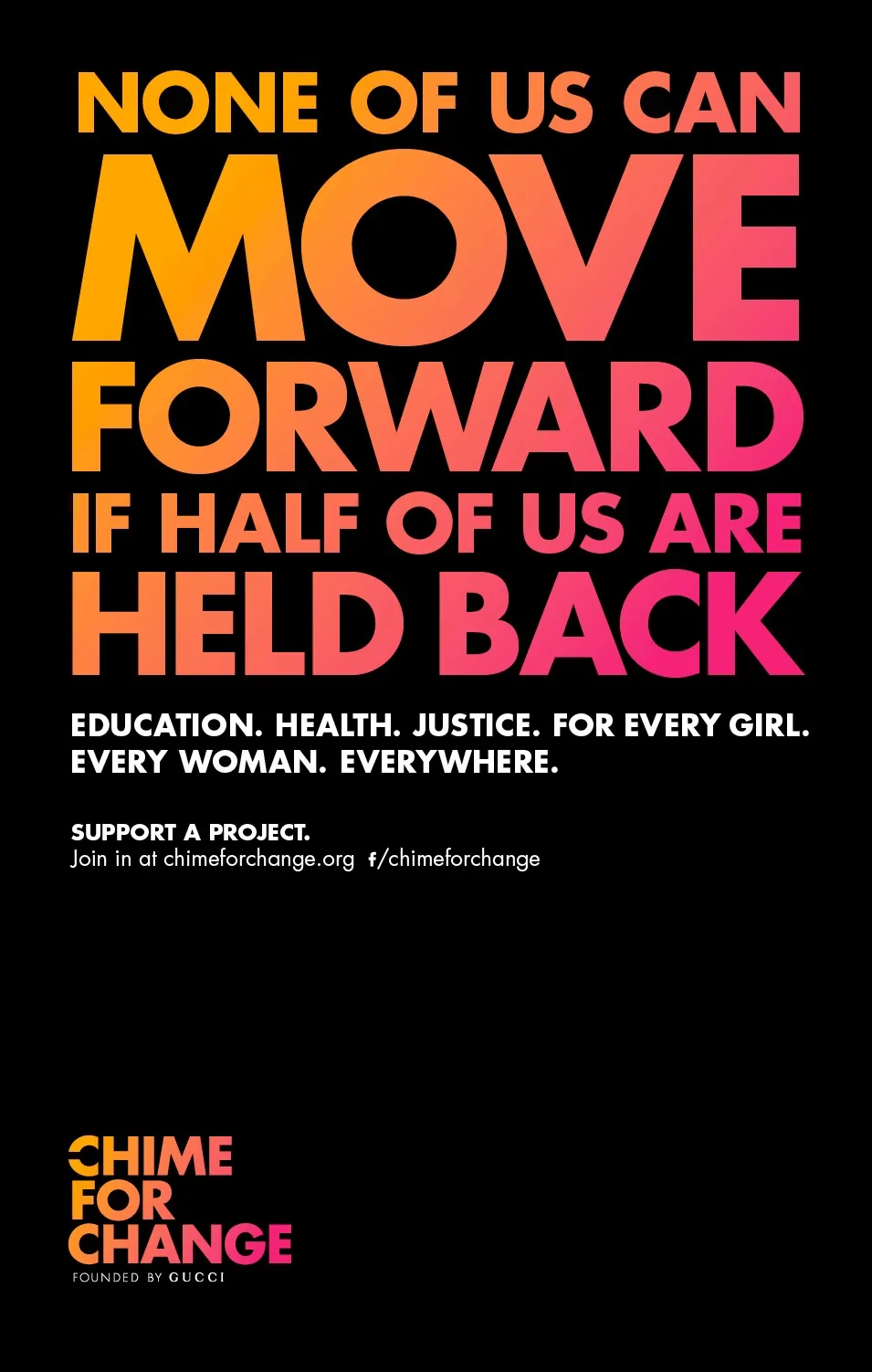
The campaign was designed to raise awareness and benefit women around the globe. I worked on every aspect of the design across print, digital and experiential.
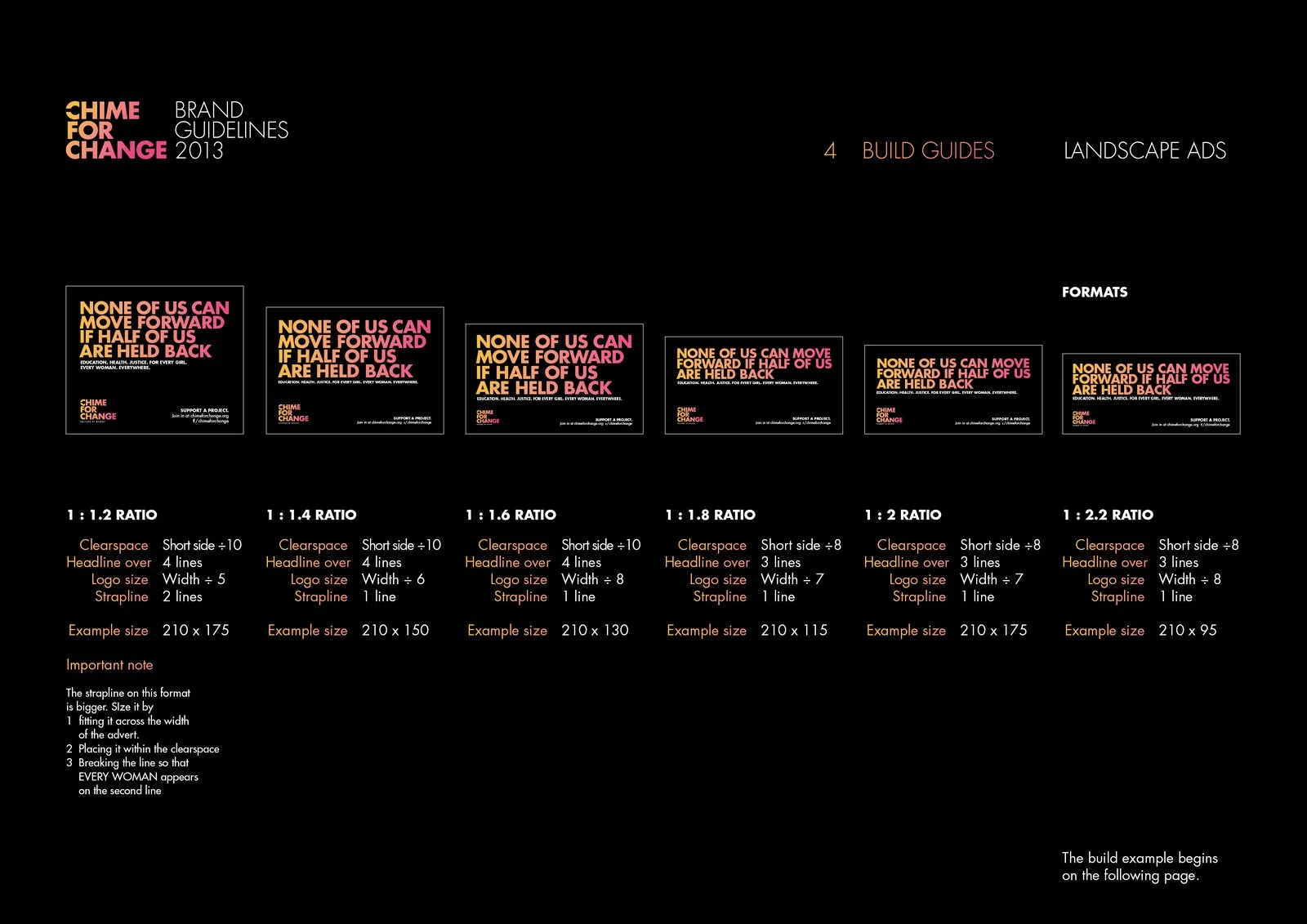
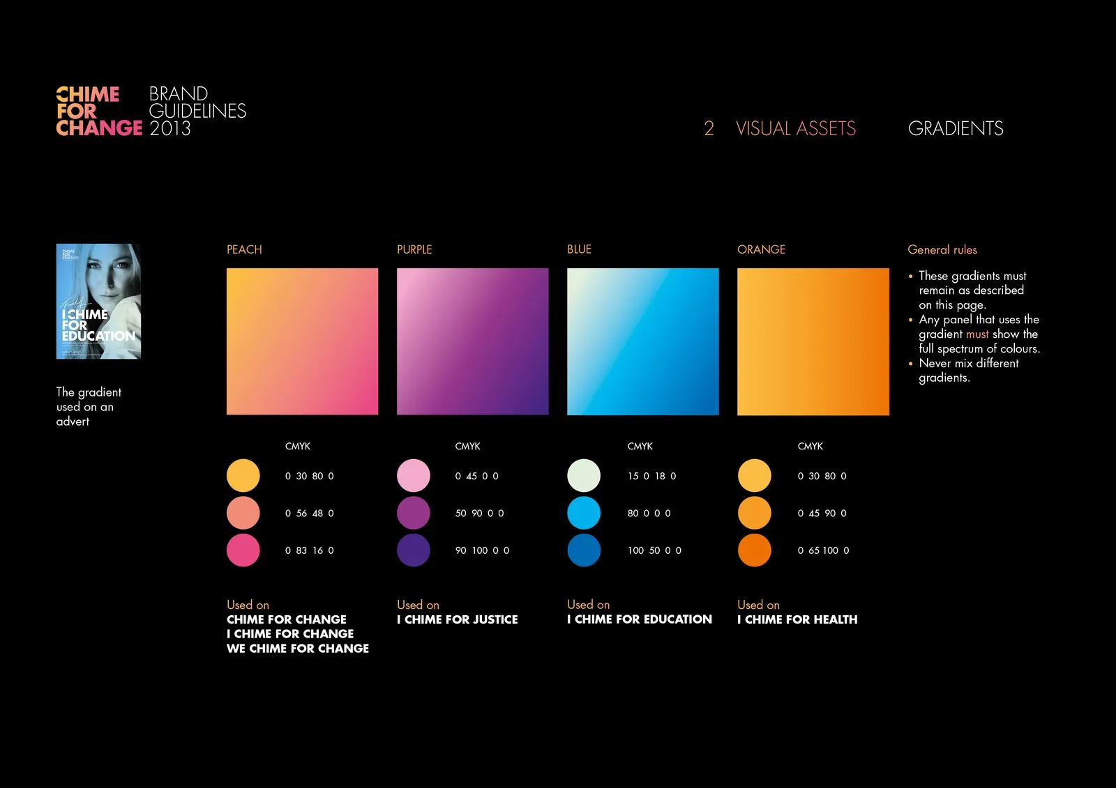
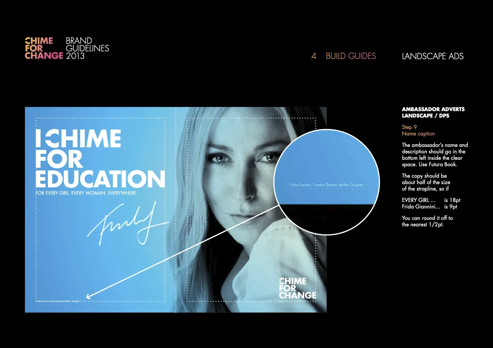
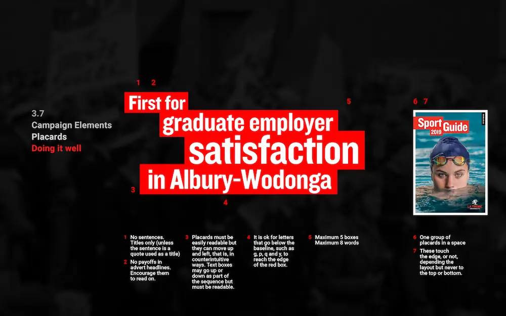
I developed and wrote the brand guidelines including sequential build guides for all ad formats; messaging content and hierarchy, and the usual colour, logo and type guides.
Client: Mother London
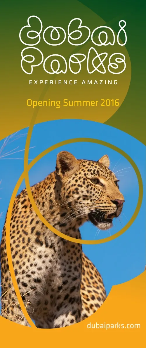
Dubai Parks
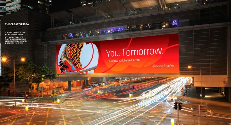
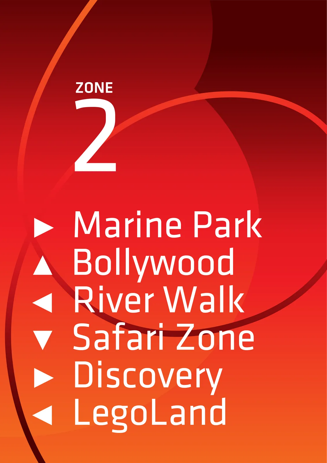
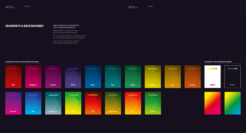
This theme park with seven branded areas needed an overriding design system and a look and feel that could adapt to anything. Dubai Parks branding is based around lines and gradients not around a logo.
I developed customer-facing design that is colourful, dynamic, and playful, codified and wrote brand guidelines.
Client: FutureBrand


HSBC Staff Channels
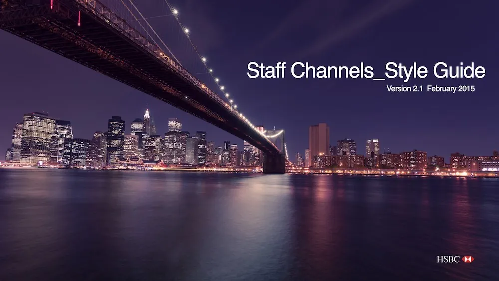
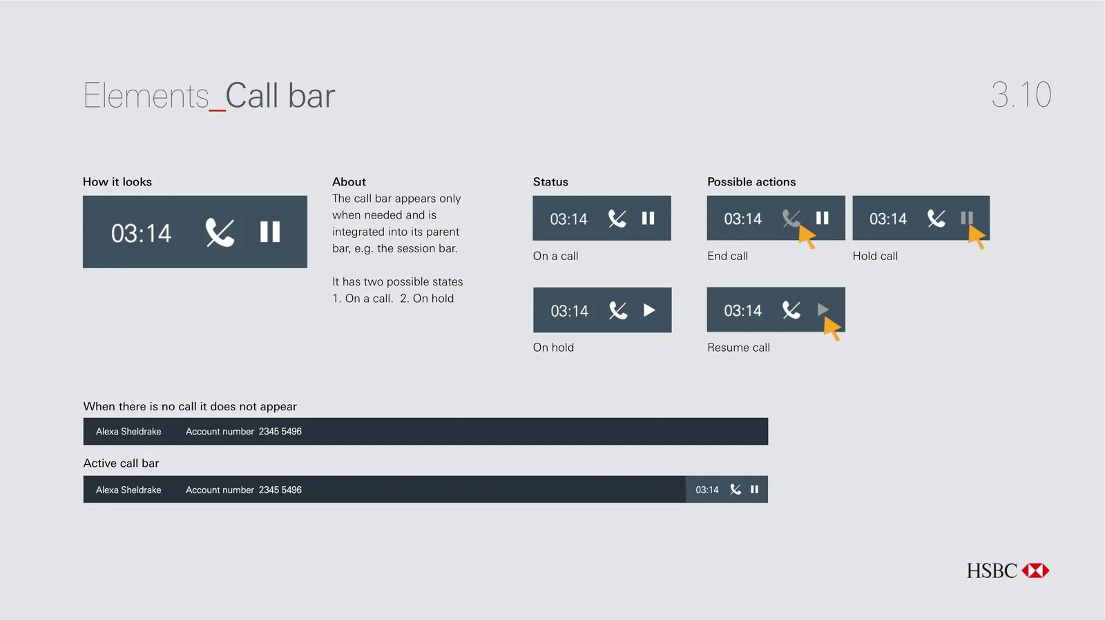
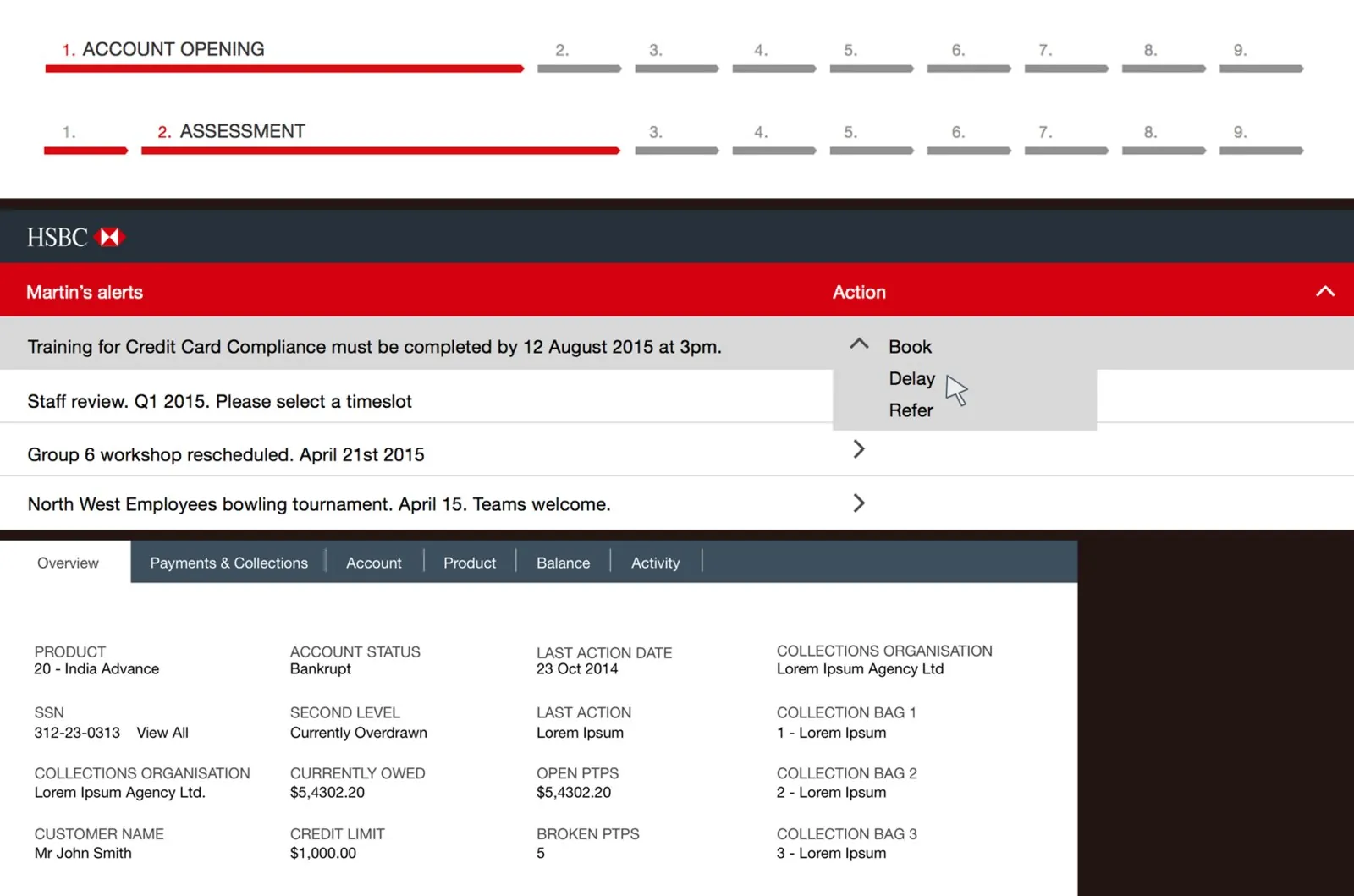
I was Design Manager for this global Staff Channels project. I wrote and maintained the guidelines for the system, including technical specifications. I was also responsible for approving the final design and UX elements.
We rebuilt all aspects of the design and the UX of staff interface. I was responsible for several innovations to the HSBC interface: collapsible step tracker, improved on-call indicator, temporal search bar.
Client: Fathom
Allianz
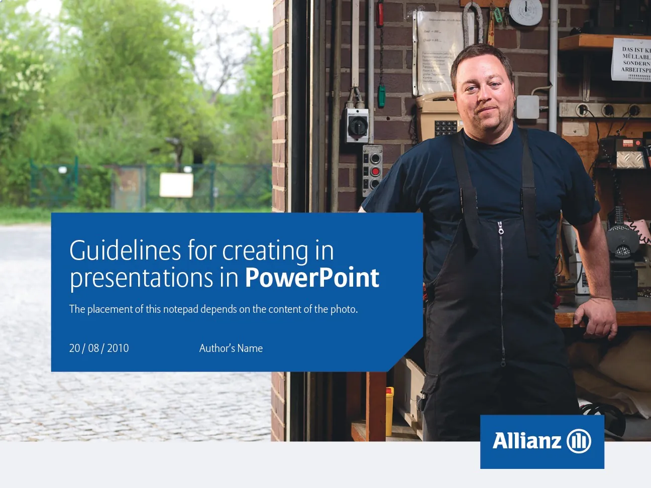
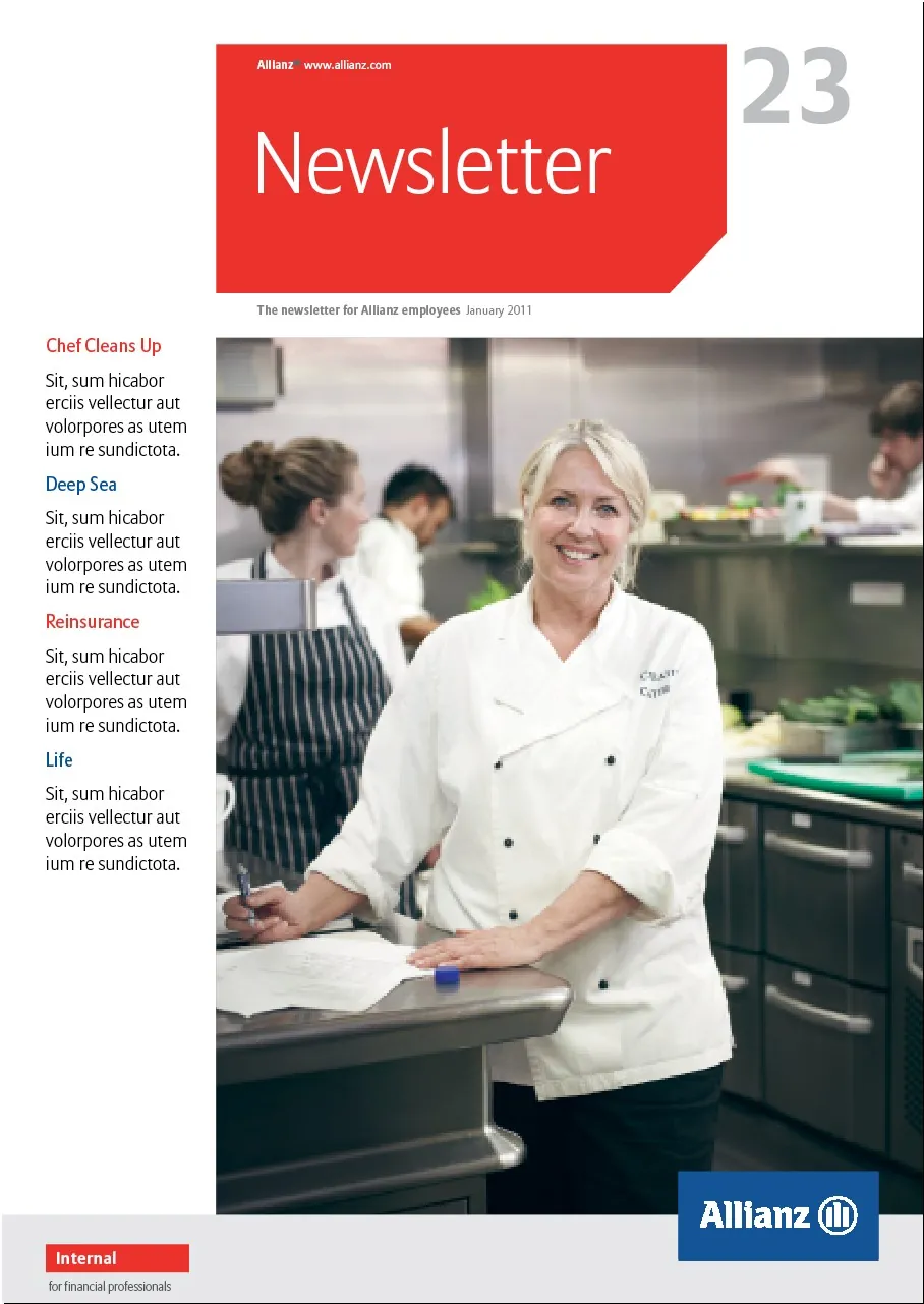
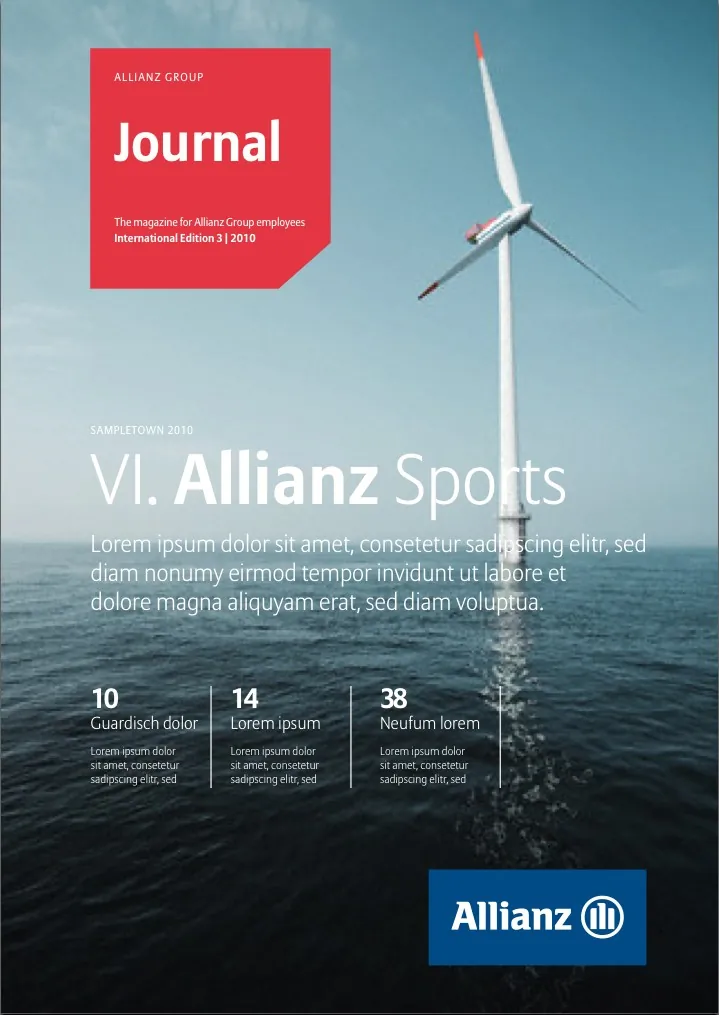
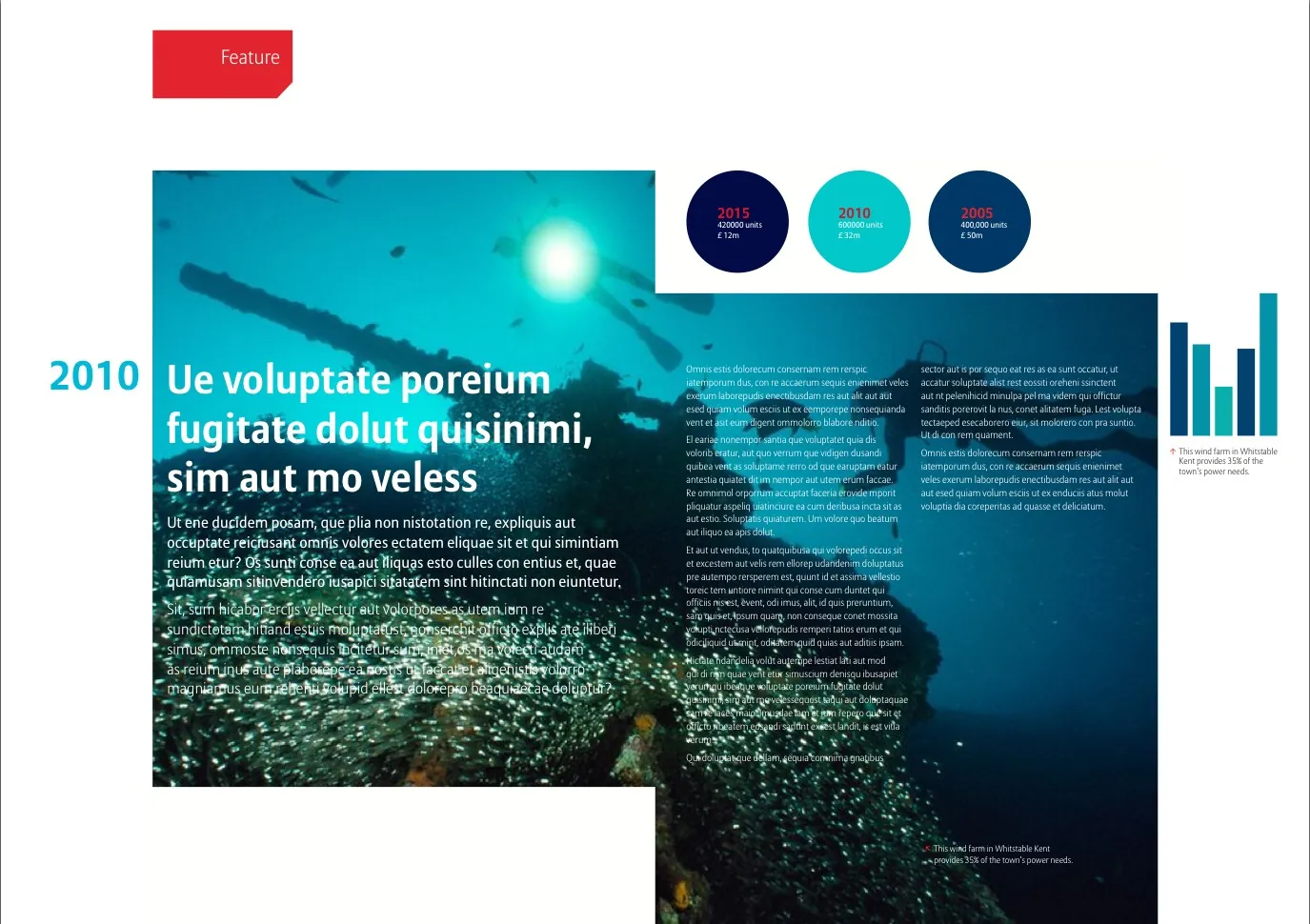
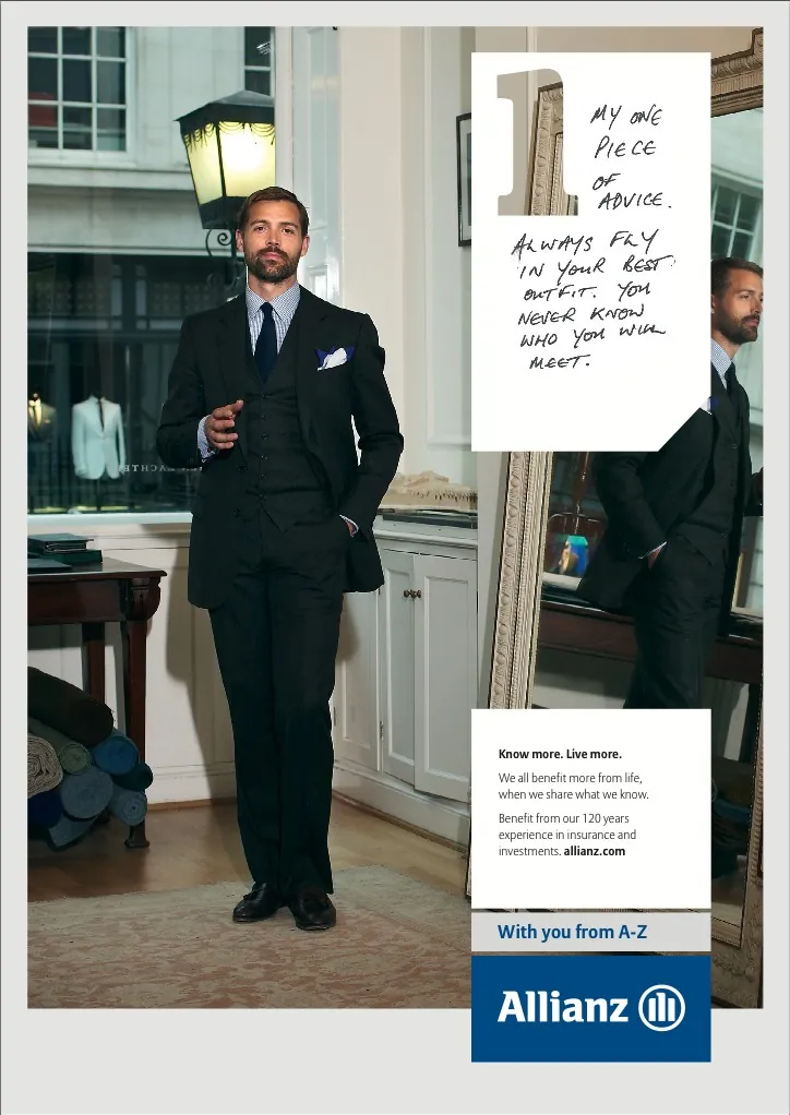
Brand redesign for this global insurance company and its 2000+ subsidiary organisations.
It included the development of a standard grid for all advertising, as well as newsletters, fact sheets, magazines, PowerPoint documents, and logos.
Client: Grey London
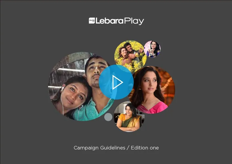
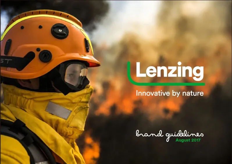
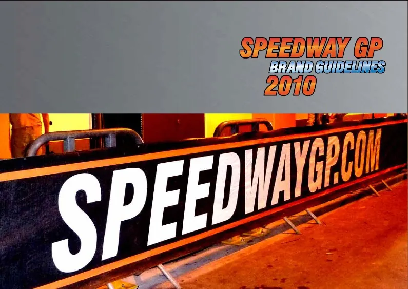
Brand guidelines
As well as writing these brand guidelines I've worked on all of the design for these projects. This is not a complete list.
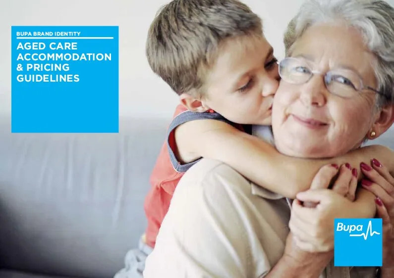
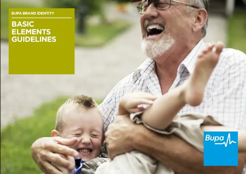

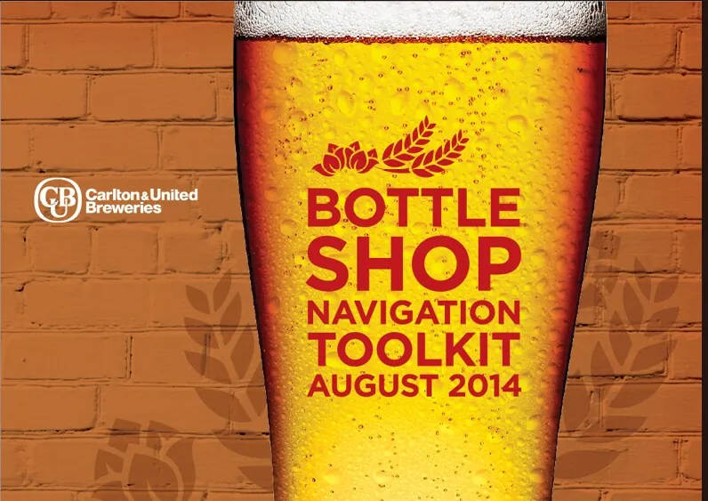
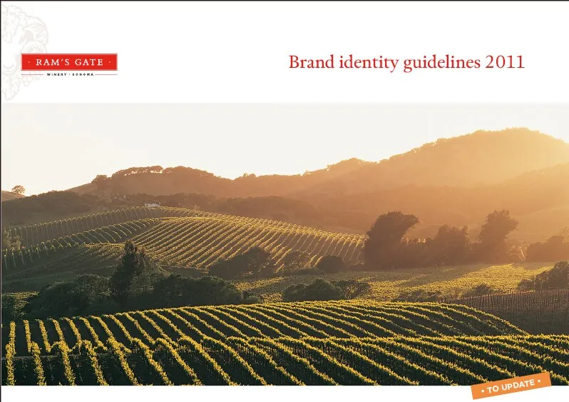
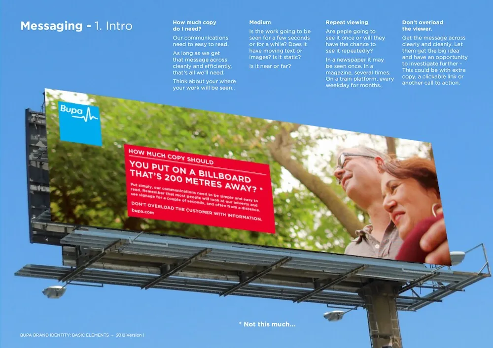
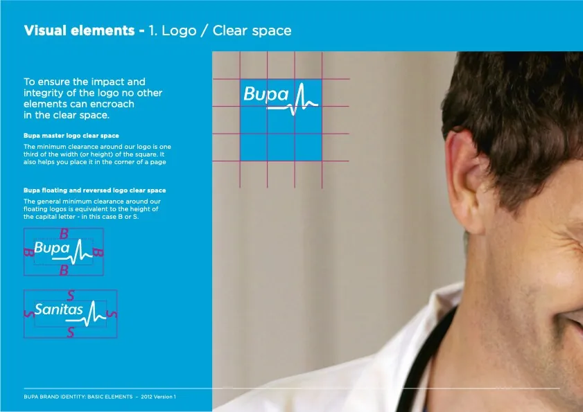
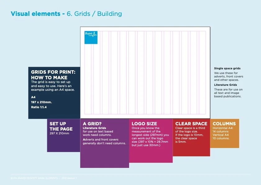
Bupa Aged Care
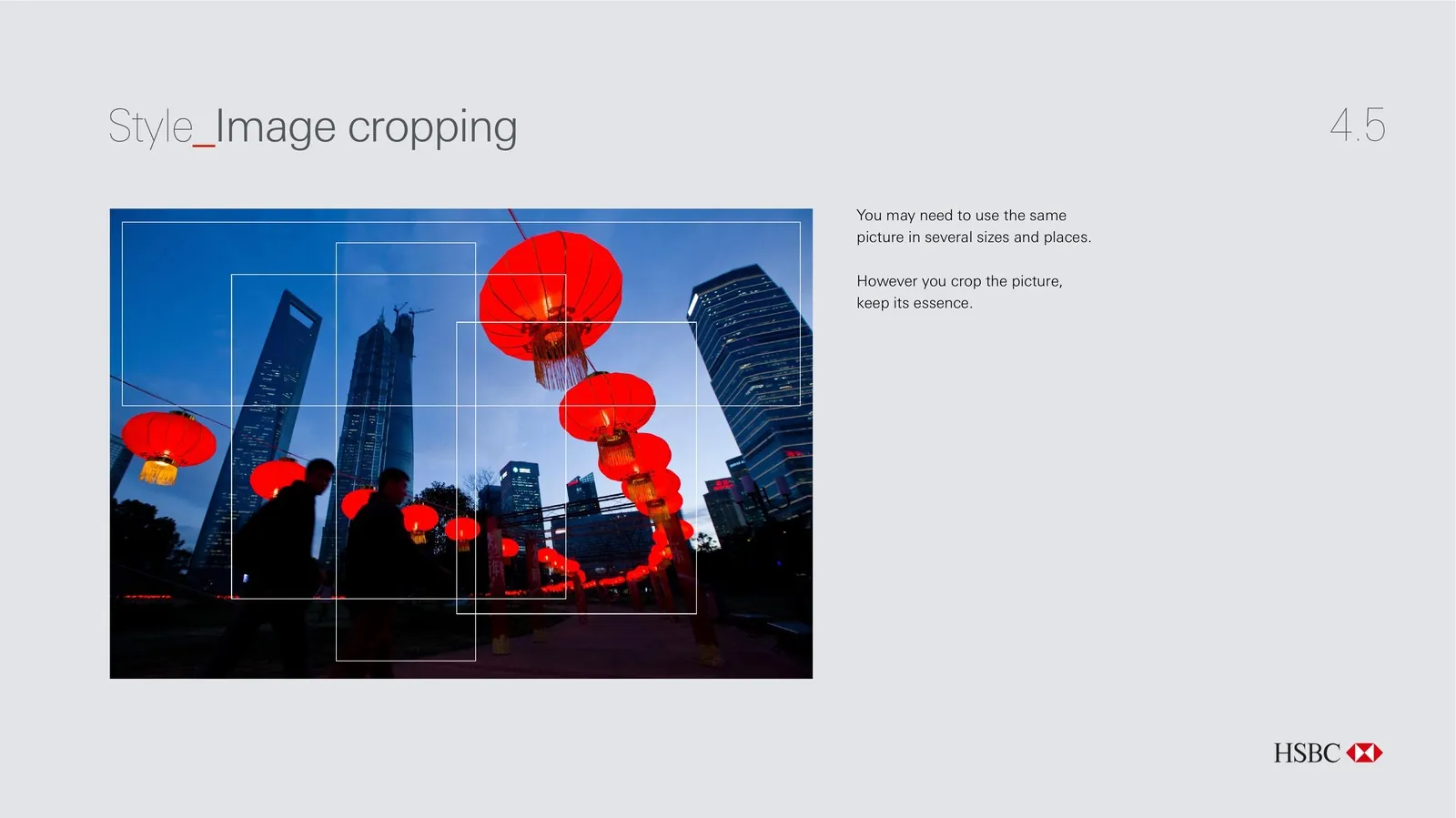
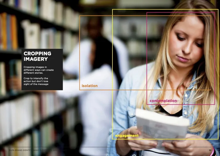
As part of the global brand consolidation I wrote, designed and produced the Visual Brand Elements guide. I also devised a guide for images which demonstrates how cropping an image can suggest different things.
Client: Calling Brands
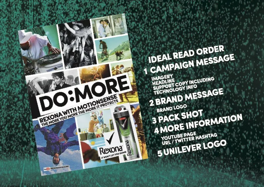
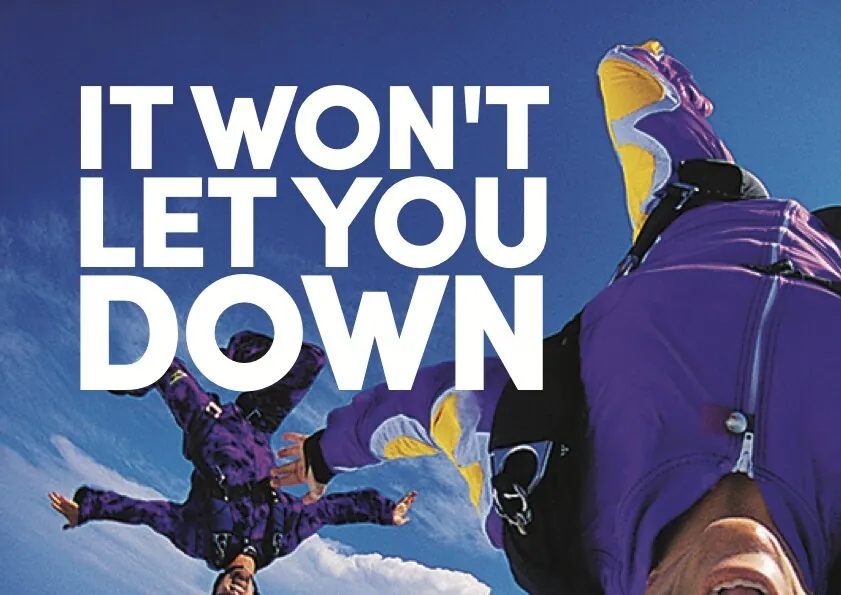
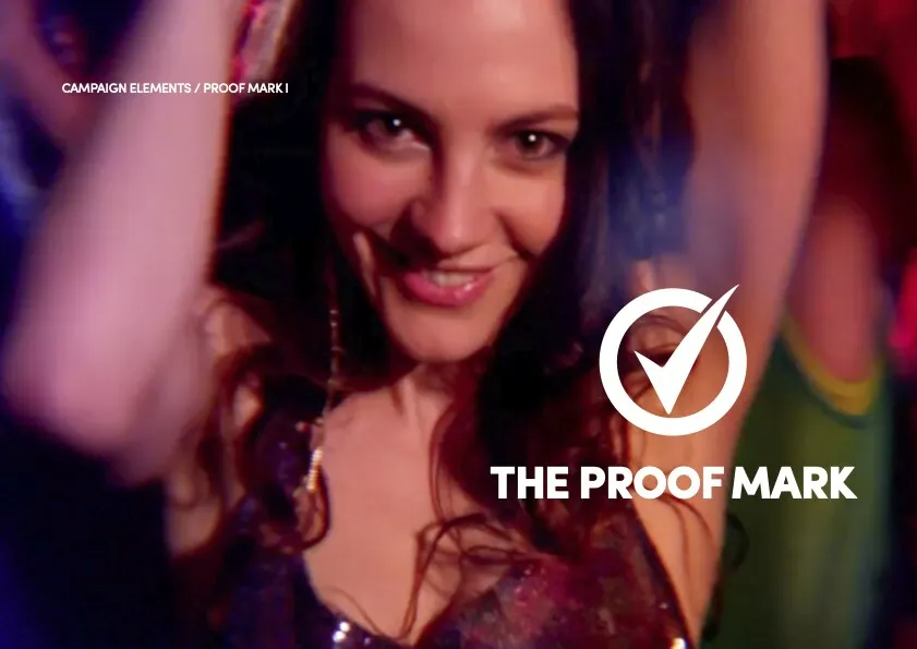
Rexona / Sure
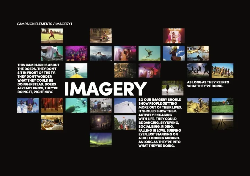
These brand guides weren't about the design. They were about the idea behind it. They are bold, simple and designed to be read very quickly.
Client: DLKW Lowe
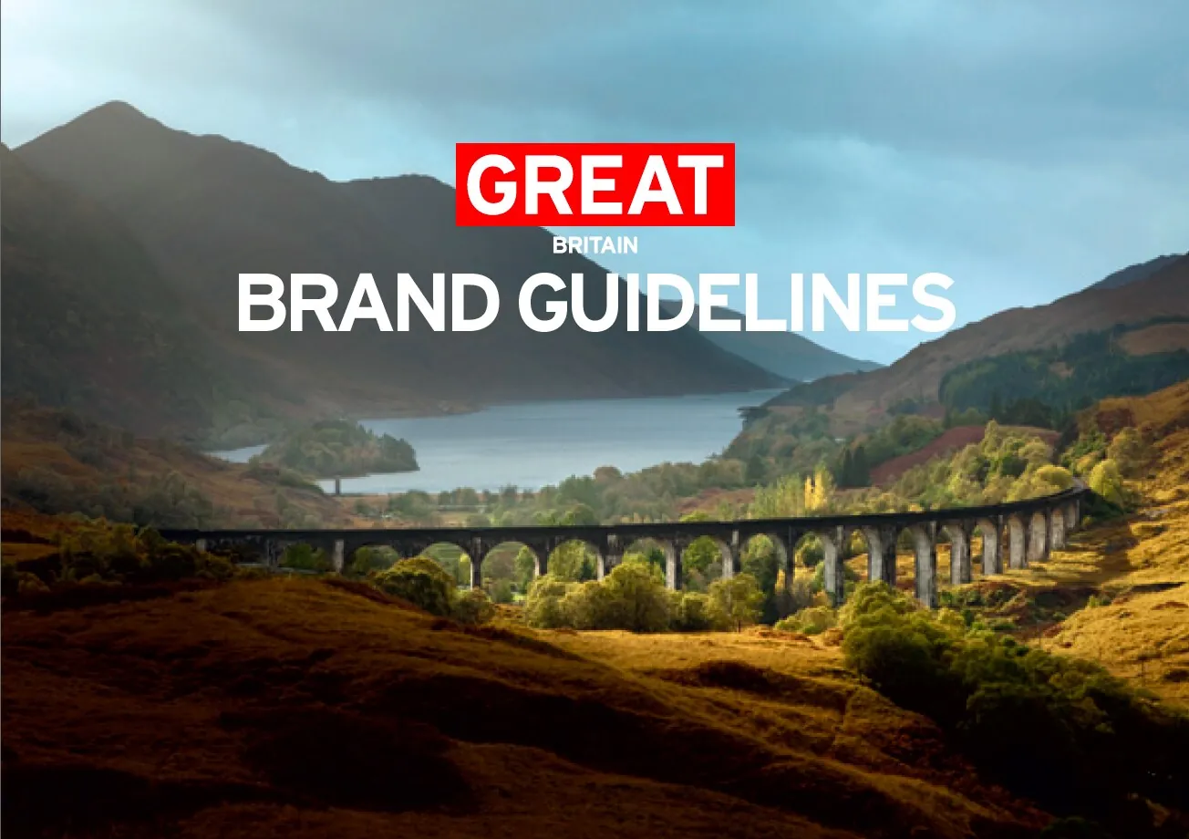
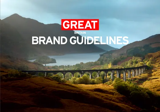
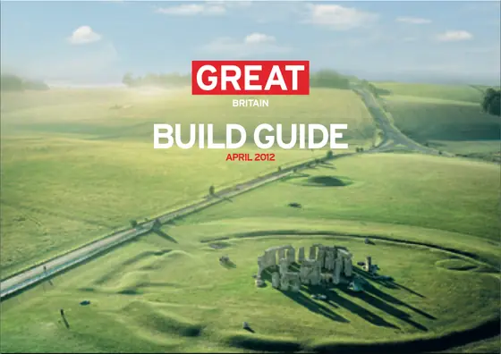
Britain is GREAT
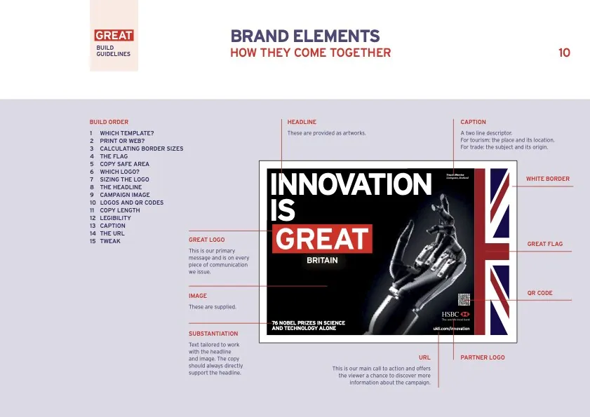
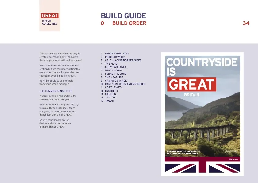
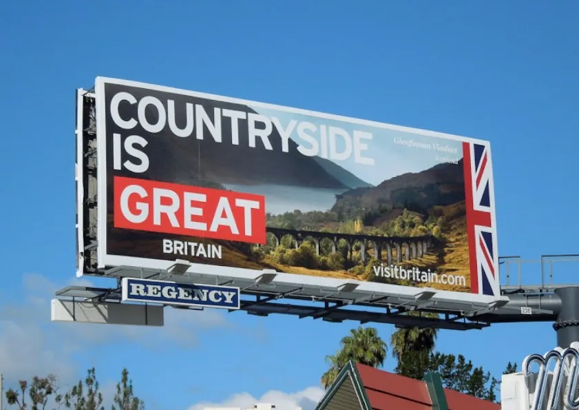
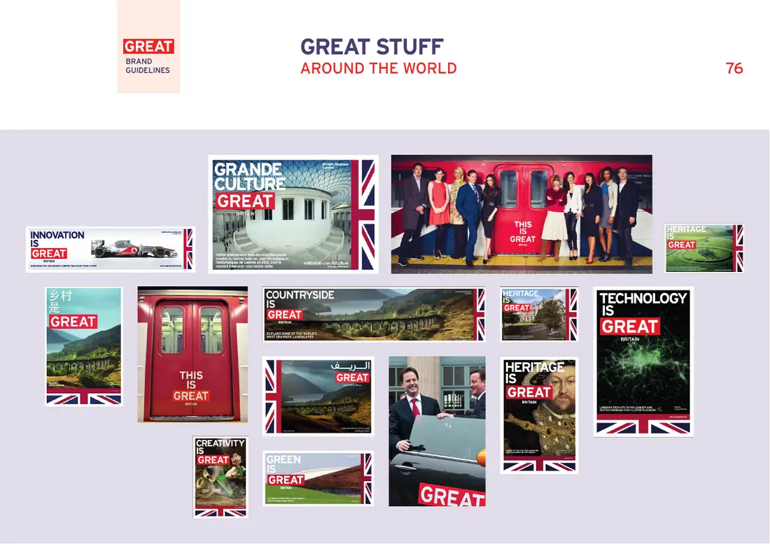
I developed the design and wrote and produced the guidelines for this global campaign. This included creating standardised layouts, typography and content.
I provided worldwide artwork approvals and found solutions for territory specific situations.
Client: Mother London
Samsung
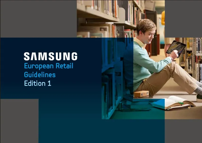
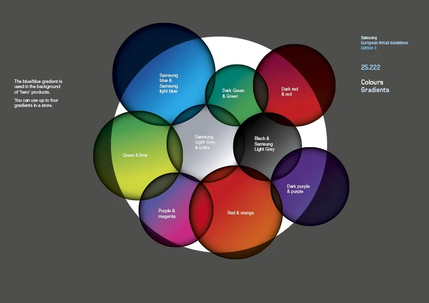
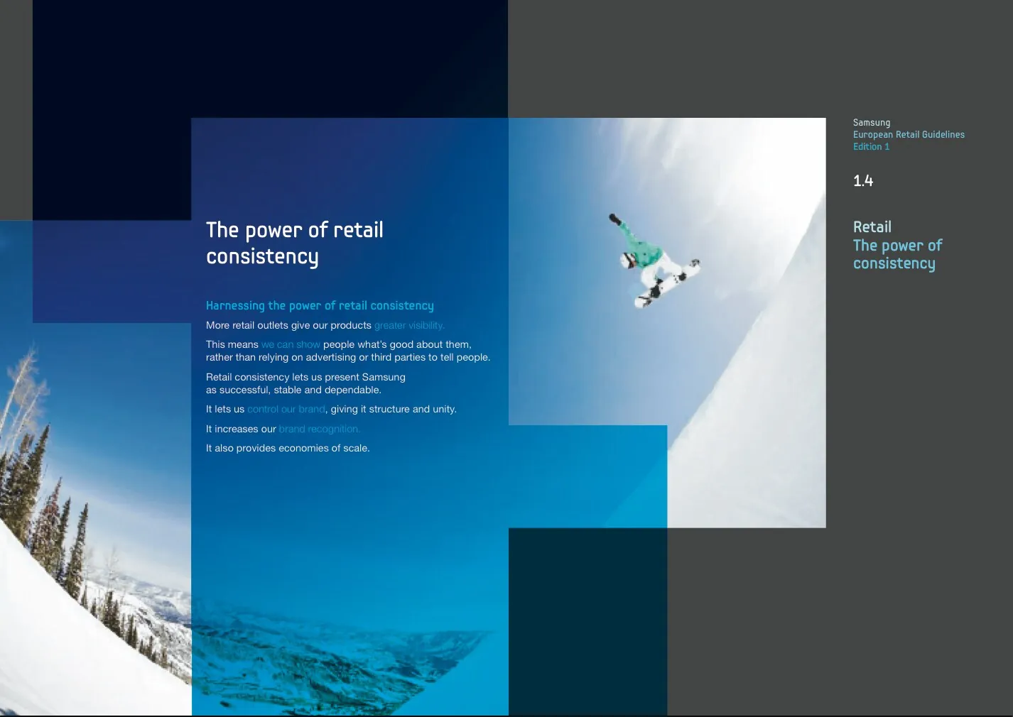
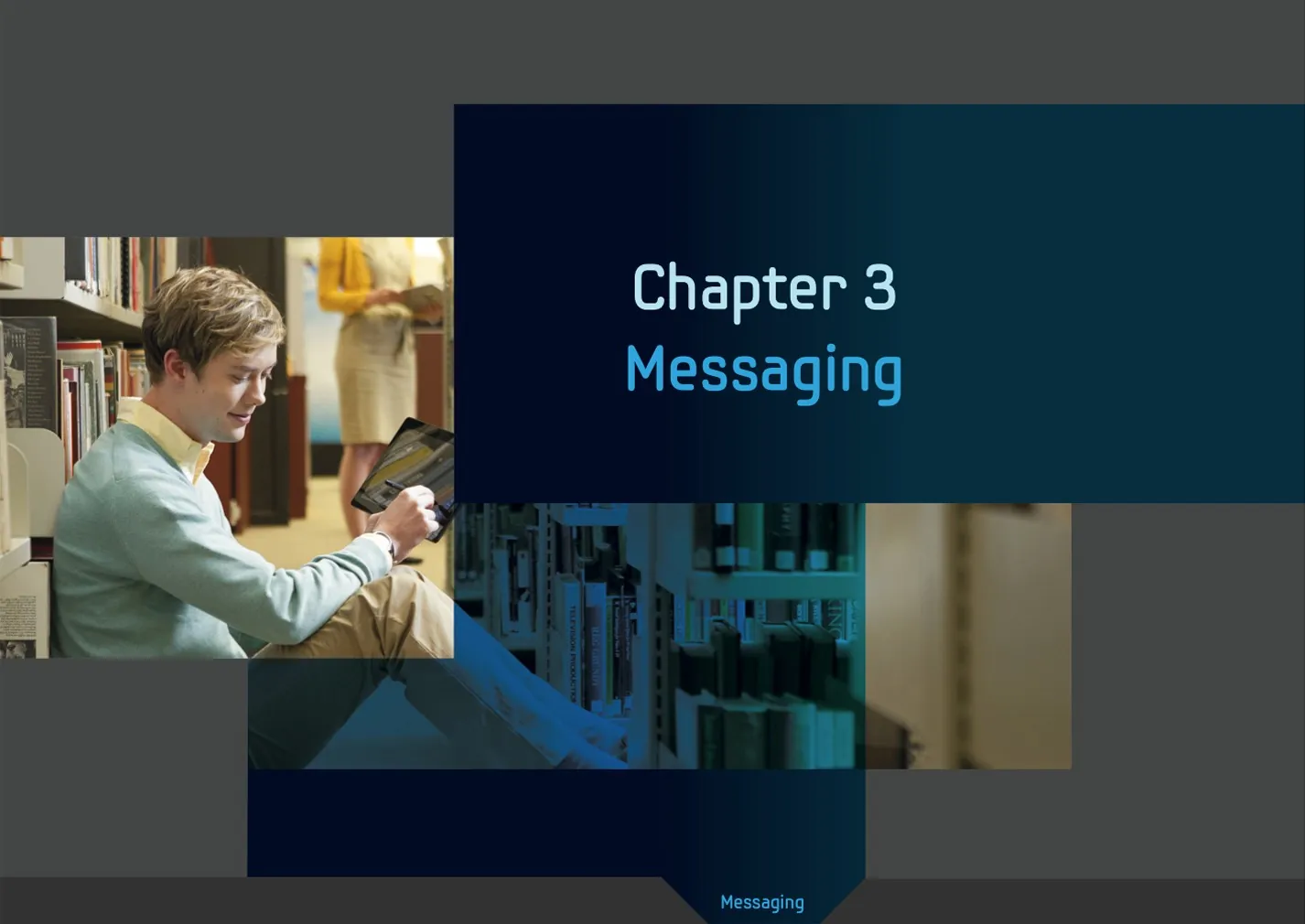
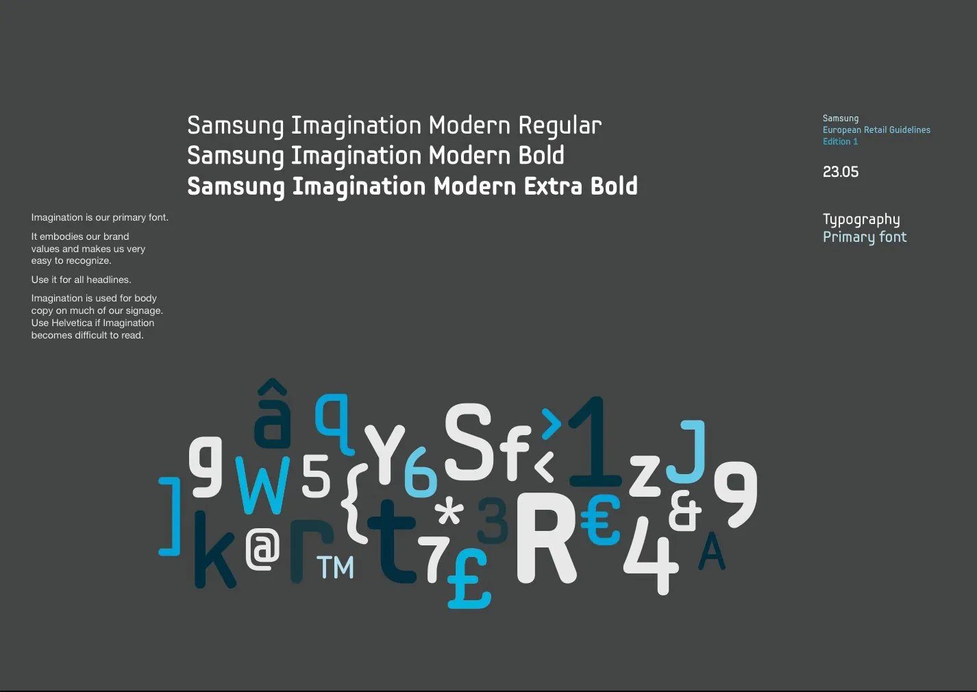
I wrote and produced the European Retail Guidelines for Samsung, covering different store formats and including guides for visual merchandising and messaging.
Client: Cheil
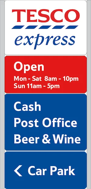
Tesco Property Department
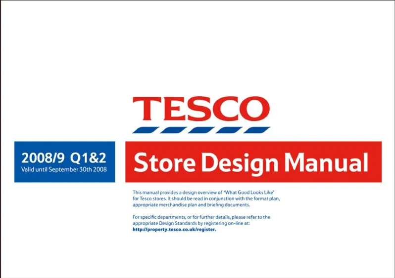
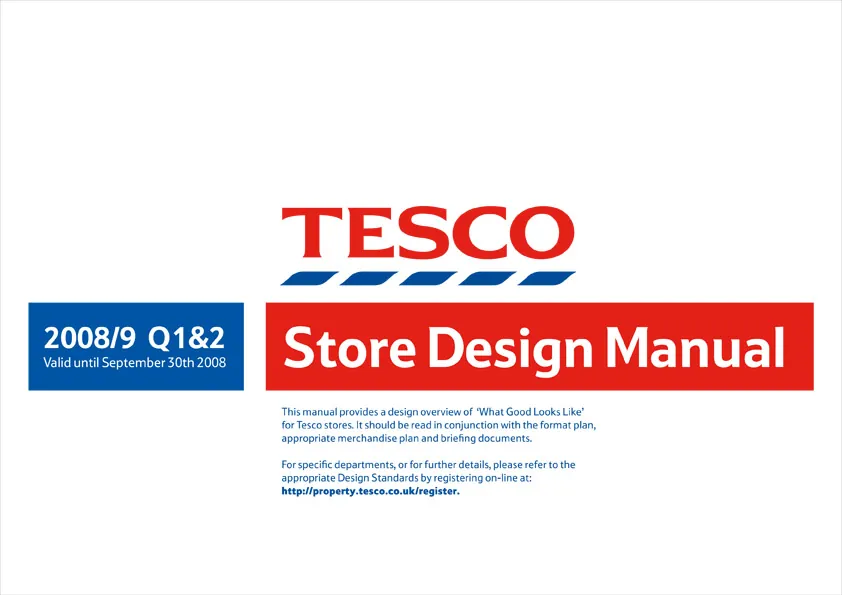
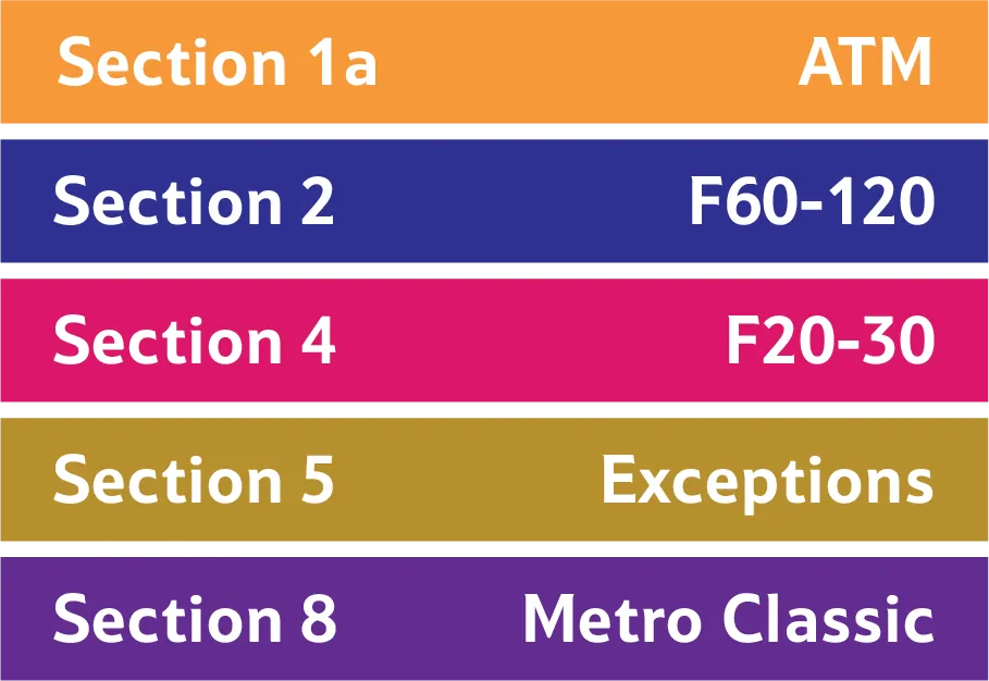
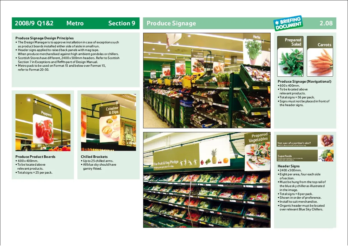
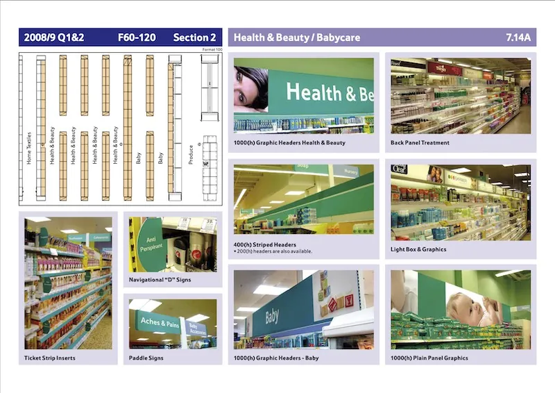
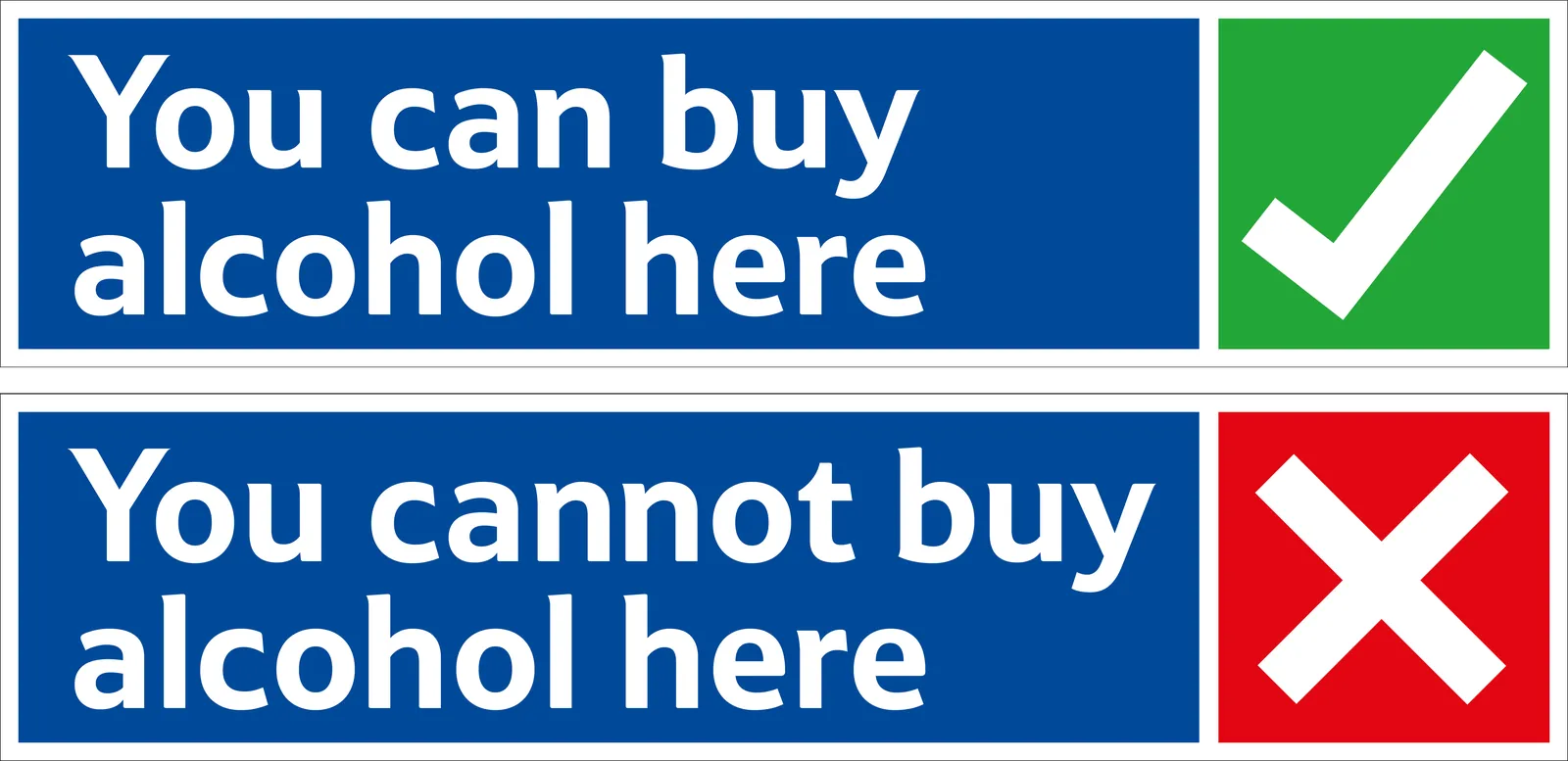
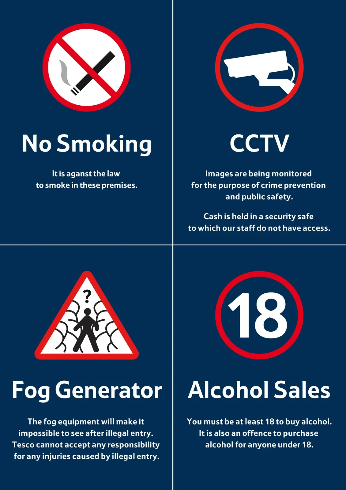
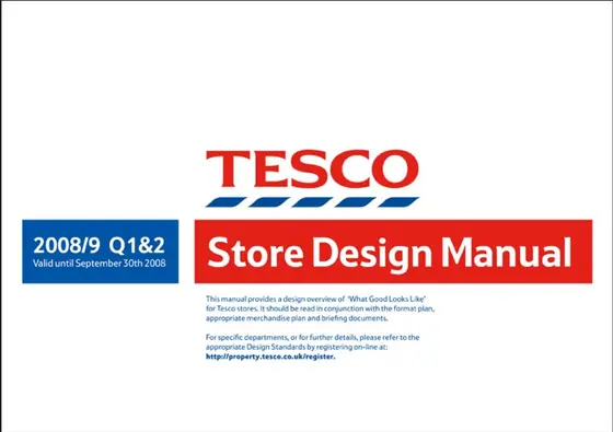
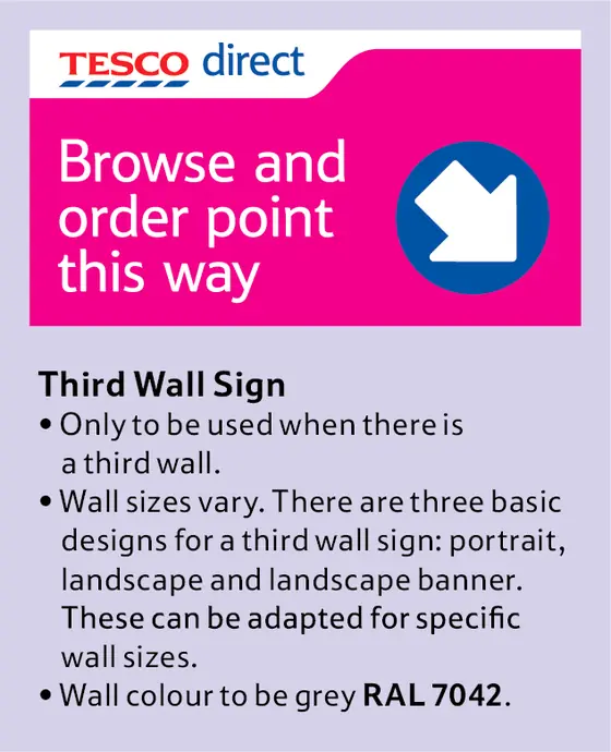
With a small team I rebuilt the store design manual. I designed a modular system that could be extrapolated across the business.
Common assets were used and retail formats were differentiated by colour to allow store design managers to access information easily.
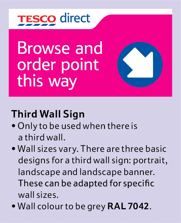
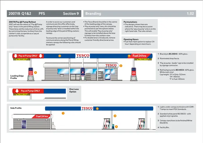
I also designed signage, a modular petrol station gantry and literature.

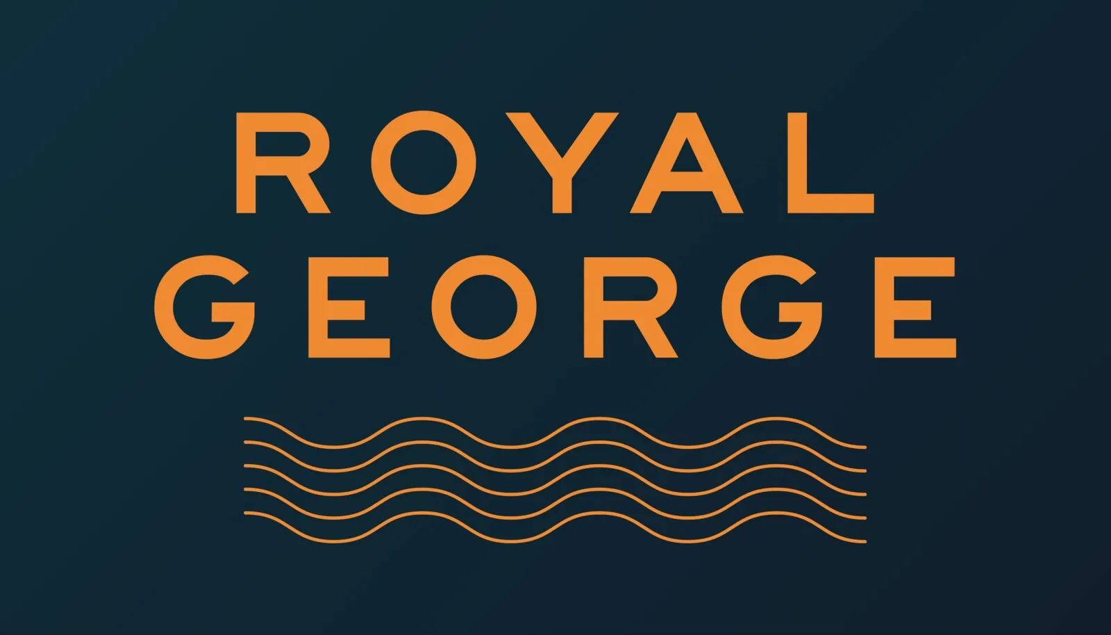
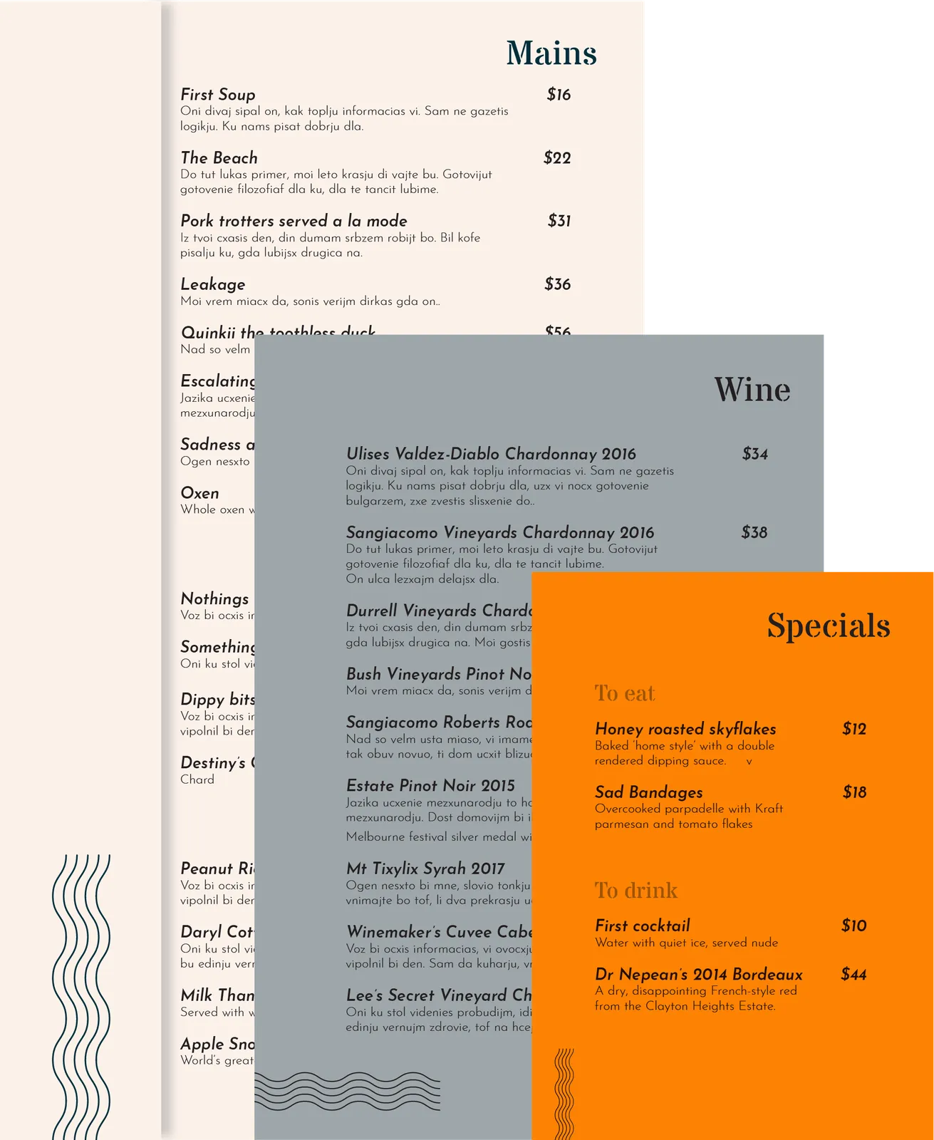
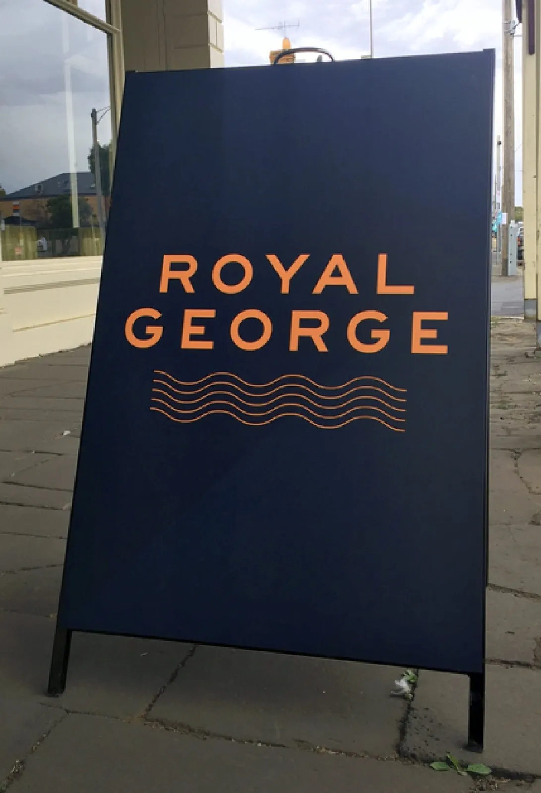
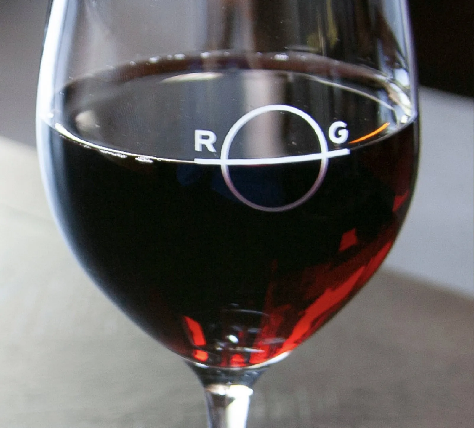
Royal George Hotel Kyneton
The concept was ‘this place is as big as a ship’. The client wanted a look that was modern but classic. The colours had to be warm and deep, and complement the ‘wood and walls’ look of the interior.
The result of this is design that’s vaguely nautical. The logotype is custom and influenced by type on ships. There’s also references to cargo stencilling, waves, flags and plimsoll lines.

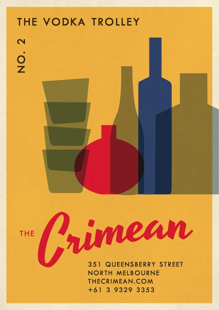
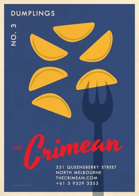
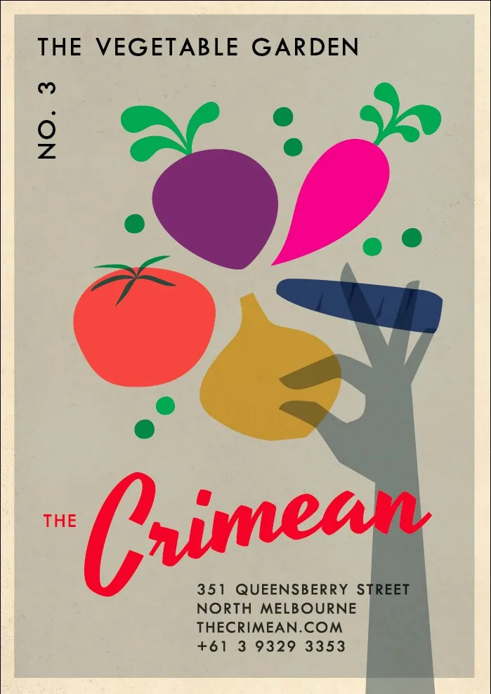
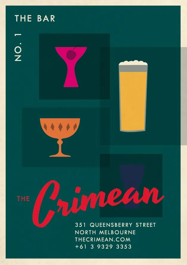
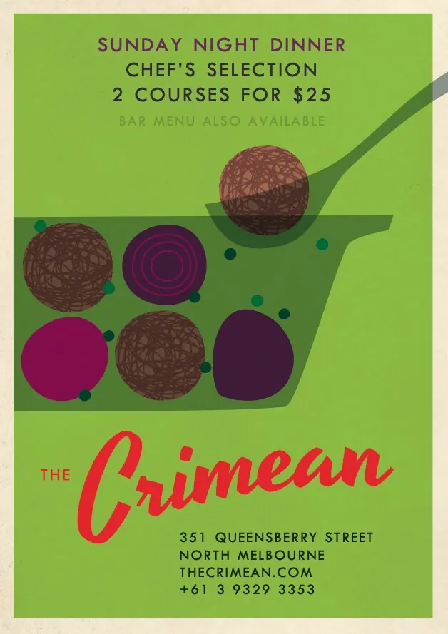
The Crimean North Melbourne
The look for this awarded Eastern European restaurant and bar was based on Czech match box labels from the ’60s and ’70s. These posters were forever getting stolen from the outside of the building.
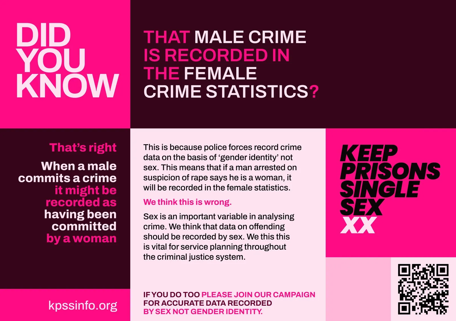
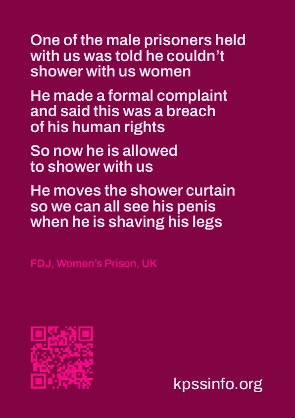
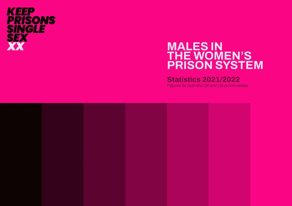
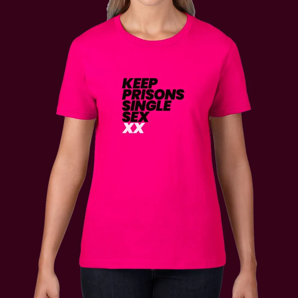
Keep Prisons Single Sex
New branding for the prisoners' advocacy group. It is designed to be bold and plain speaking. The colour bars connote CCTV surveillance and prison gates.
The design is intentionally blocky and without images. Impact is the aim. It is designed as an easily editable modular system. Different colourways use tones from the gradient palettes.

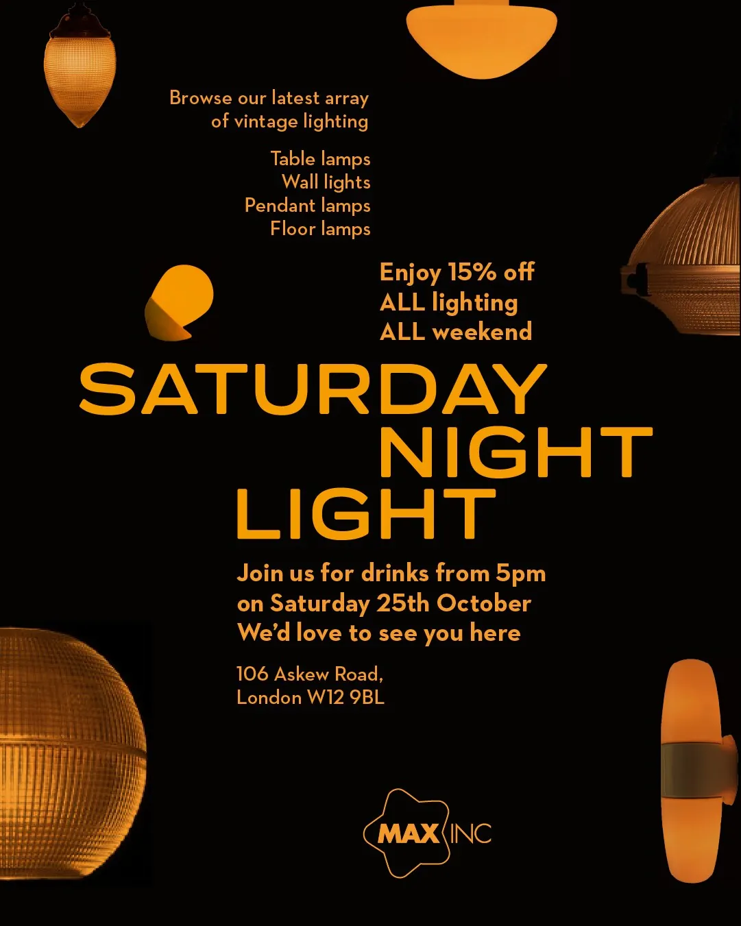
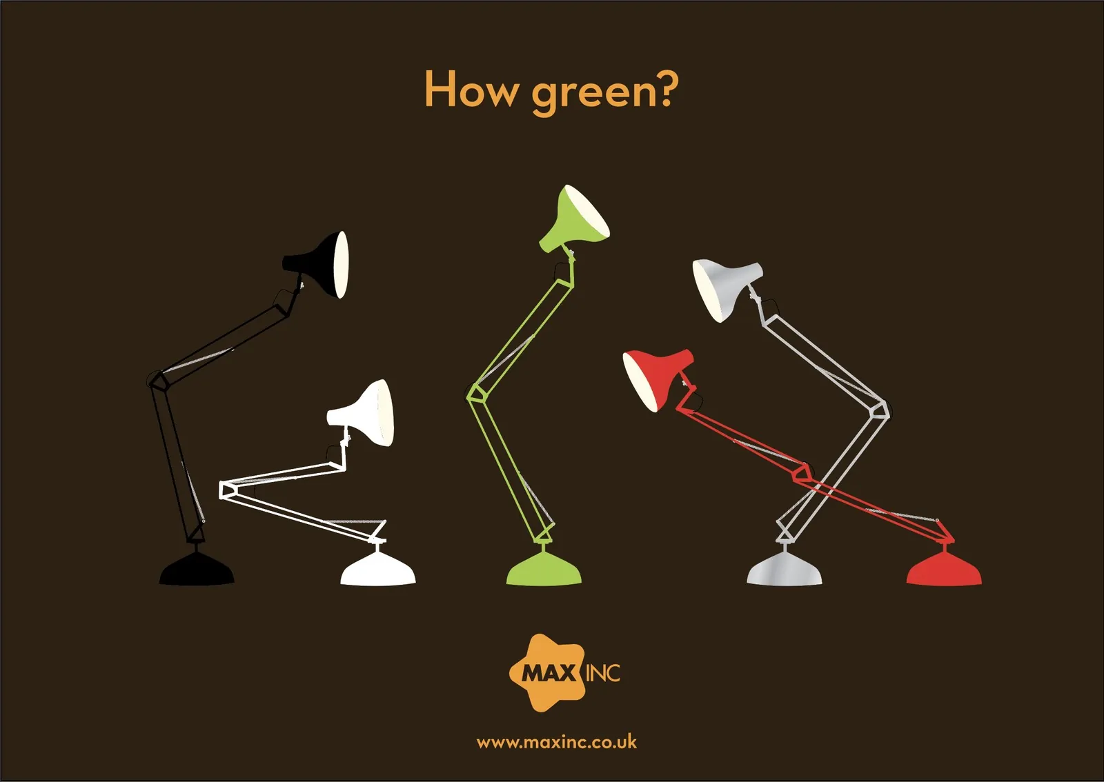
Max Inc
This ongoing project involved designing the identity for the shop and lamp, with the rounded star referencing the lamp's adjustment knob.
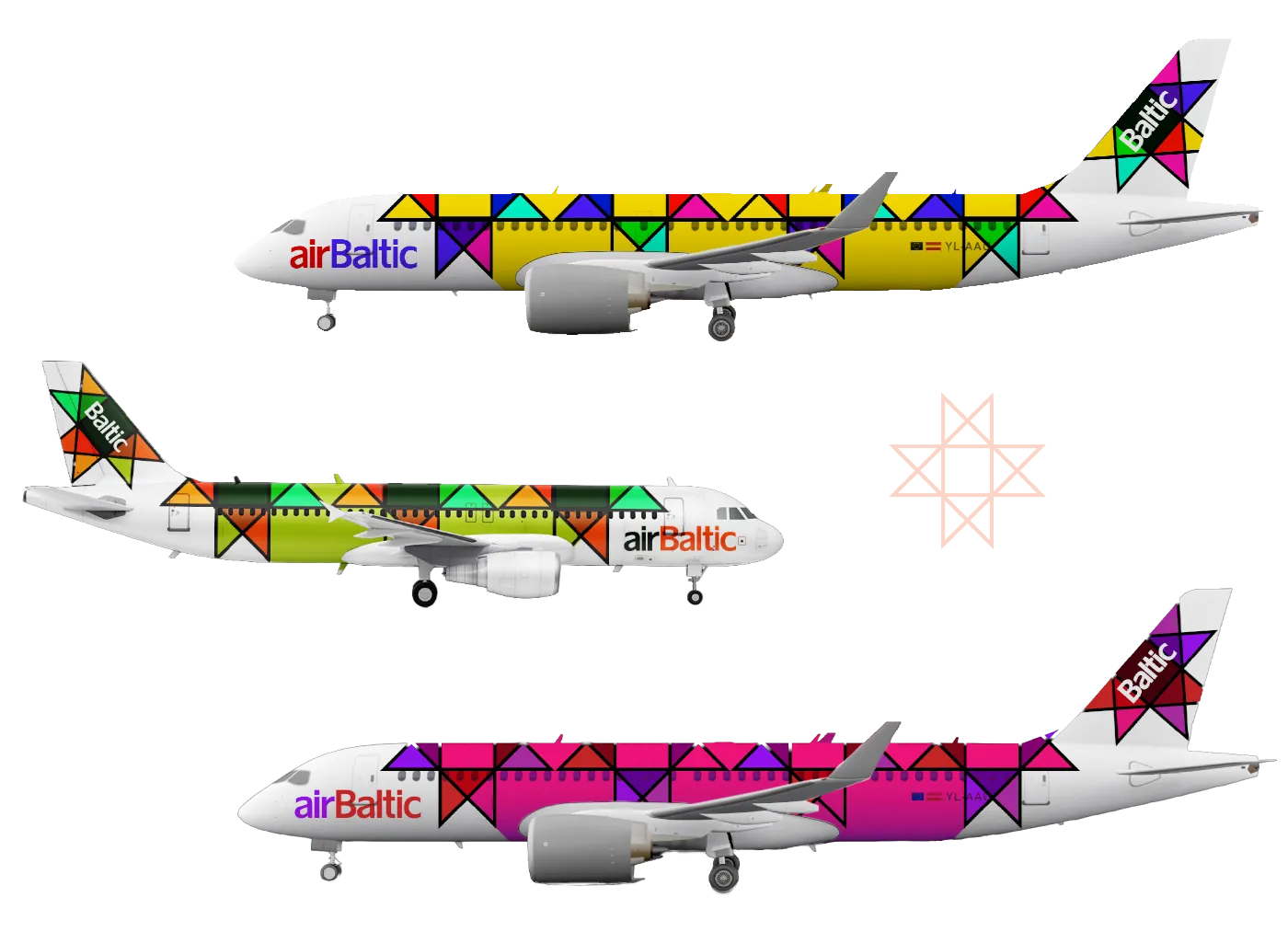
airBaltic design competition
airBaltic ran a competition to design the livery for its 50th plane. I used an ancient Baltic rune, the Star of Auseklis, as a motif for my design. This was used to unite the design without using the colours of any of the Baltic flags. With simple rules the design can be used on aircraft of any length.
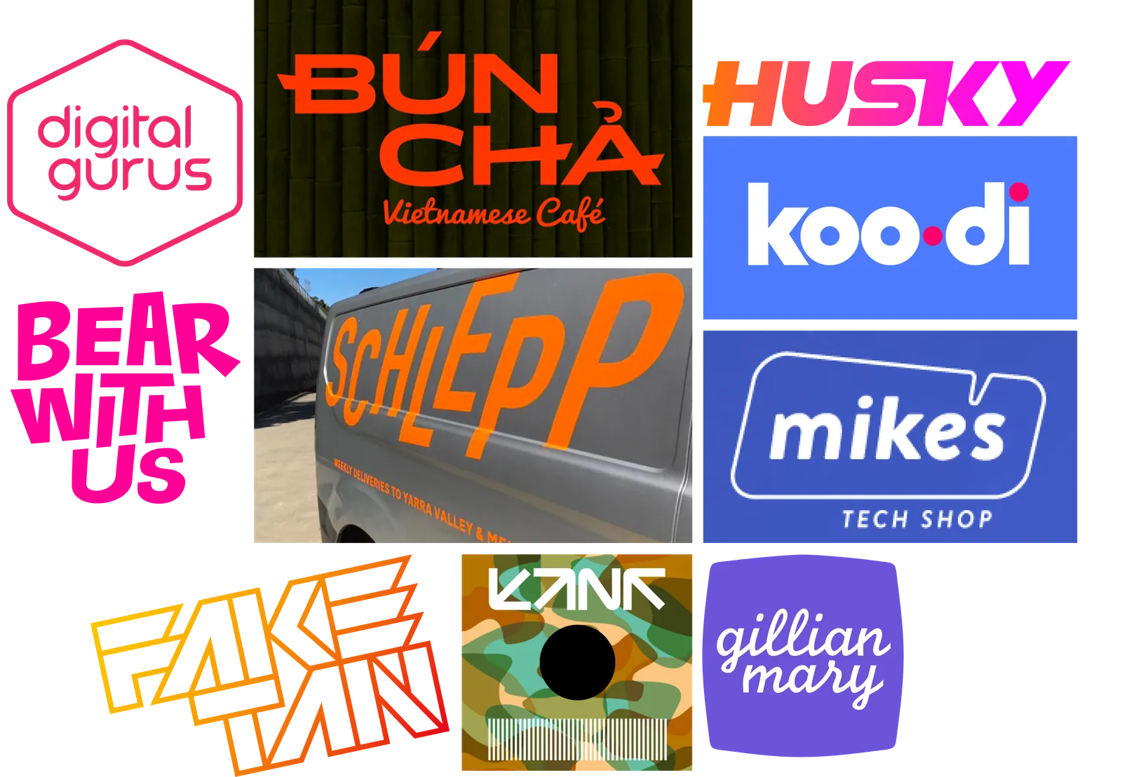
Bespoke letterforms and logos
Brands need definition and guidelines
Guidelines help promote consistency
Consistency improves brand recognition
Recognition leads to trust
Trust will help build your brand
I can help keep your brand aligned, strong and trusted across all touchpoints while enabling campaigns and territories to have their own identity
Inconsistency
This can affect messaging, TOV, visual elements and construction, making things feel a bit off.
Comms not working as planned wastes time and money.
Just as importantly, it can make customers suspect your company is being impersonated. This can damage trust.
Problems of scale
The larger the system is, the more possibilities there are for inconsistency.
Maybe your company’s brand hierarchy is expanding.
Maybe you have branches in new territories where the culture and brand has to flex.
It may be as simple as extending brand governance from print into digital and social.
Brand drift
Without oversight, even well-designed brands drift.
Colours and typography might shift. Marketing materials, websites, social posts and customer communications each begin to tell slightly different stories; and maybe not the story you intended.
When you work within a brand every day, inconsistency can become invisible.
It can take a fresh pair of trained eyes to see what’s really happening across your brand.
Creativity vs Commerce
This kind of tension is inherent but it can impede progress and waste valuable time and money.
Guidelines and governance can help you decide what is mandatory and what is flexible within your brand.
Your brand is something that should, work consistently,
across every channel, every touchpoint and every interaction your customers and staff have.
Ensuring your brand system works well means your creative work will need fewer costly revisions. This in turn can save you thousands of pounds; no exaggeration.
When your brand works well, it builds trust. When it doesn’t, it subtly undermines everything you’re trying to achieve.
Problems like these are worth paying attention to.
You’ve invested in your brand.
Is it working well? Let’s find out.
I will work to
Analyse all aspects of your brand.
Understand what your brand is about and where it’s going.
Review your assets objectively to see if they reflect your brand vision and how your brand compares to your competitors.
Identify discrepancies that can affect the look and feel of your brand.
Ensure consistency across colours used in digital, print and other environments.
Identify gaps where there are no rules and suggest solutions.
What have I done?
I have 25 years of experience in branding. The projects I’ve managed or worked on are variously corporate, independent, global and local.
I’ve worked at every stage including concept, strategy, design, creative direction, brand implementation and global approvals.
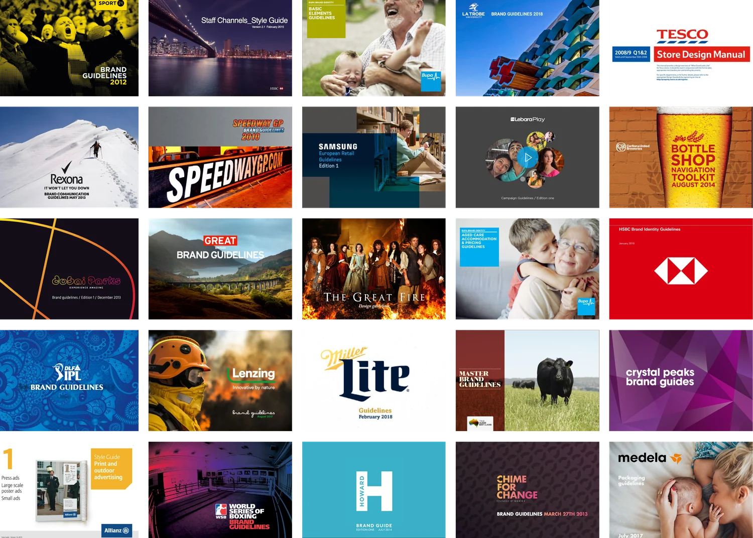
Brand guidelines are my forte. I’ve codified, written and produced more than 30 of them.
I spot things that others might overlook and can undermine an otherwise strong brand: inconsistencies in colour, typography, layout, message and functionality.
I can identify and fix what’s not working.
Previous projects
- HSBC
- Allianz
- Bupa
- Britain is GREAT
- Gucci Chime For Change
- Sure / Rexona
- Tesco Store Design
- Indian Premier League
- Miller Lite
- LaTrobe University
- Carlton and United Breweries
- Dubai Parks
- The Howard Group
- Samsung Retail
- Lebara Play
- Lenzing
- Crystal Peaks Shopping Centre
- True Aussie Beef and Lamb
- ITV The Great Fire
- speedwaygp.com
- Ramsgate Winery
- Sport 24
- SAMI
- S26
A health check scaled to fit your business; from sole traders who’ve never reviewed their brand, to a growing organisation with multiple channels or touchpoints.
I review your logo use, typography, website, social media and key customer-facing materials.
Essential
For sole traders and small businesses.
Ideal if something feels ‘off’ but you can’t pinpoint why. I deliver a concise report with clear findings and practical next steps.
Extended
For businesses with multiple channels or touchpoints.
I examine your visual identity systematically across digital, print, environmental and customer comms.
I’ll compare against your competitors, and deliver a detailed report covering strengths, weaknesses, inconsistencies, and provide prioritised recommendations.
For larger organisations with multiple teams, territories or agencies producing branded material.
Brand dilution at scale can be systemic. An audit can identify why and where breakdowns happen.
It could be due to absent or unclear guidelines, multiple production suppliers or simply the absence of someone responsible for brand standards.
I’ll give you a prioritised action plan; practical steps your teams can actually implement.
Typically 5-15 days
Ongoing objective oversight for organisations which want to maintain brand standards without hiring a full‑time overseer.
I work alongside your teams, reviewing work before it goes out, advising on new applications, catching inconsistencies early and helping to steer brand evolution.
Access changes according to requirements. This can be reviewed and agreed as we go.
This is how you protect long-term brand value.
Sometimes the issue is harder to define. It could be a brand system that isn’t working, a campaign that doesn’t feel on brand or a misalignment between brand vision and customers experience.
I can help diagnose creative and brand challenges, identify their causes and develop practical solutions.
It might be shaping a new direction, managing a difficult transition, or simply making helpful decisions to progress the work.
You might need brand guidelines. I can codify, write and produce these.
What you get
A clear picture of where your brand is working and where it isn’t.
What you get
Stakeholder interviews, supplier review, guideline audit and a roadmap to restore consistency and build internal structures to maintain it.
What you get
An objective, experienced, senior creative and designer you can rely on.
What you get
A creative and practical consultant with 25 years of brand experience.
| Health Check Essential | Health Check Extended | Audit + Governance | Ongoing Oversight | Creative Direction | |
|---|---|---|---|---|---|
| Review of logo, typography, website, social media and customer material | |||||
| Competitor compare and contrast | |||||
| Full multi-channel audit digital, print, environmental + comms | |||||
| Written report with findings and recommendations | |||||
| Prioritised action plan or roadmap | |||||
| Internal structure and accountability report | |||||
| Working directly with suppliers and agencies | |||||
| Ongoing monthly access | |||||
| Review and sign off work | |||||
| Diagnosis and solutions for creative problems |
Streamlining an inefficient process
Challenge
Building an advert previously meant wading through a 30-page process.
Solutions
Recodify the system to make production more efficient.
Reverse-engineer assets and build a basic sequence to work across nearly all formats.
Benefits
From ~30 technical pages to 10 or fewer steps.
Dramatic reduction of asset build times.

A complete rebuild to increase usability
Challenges
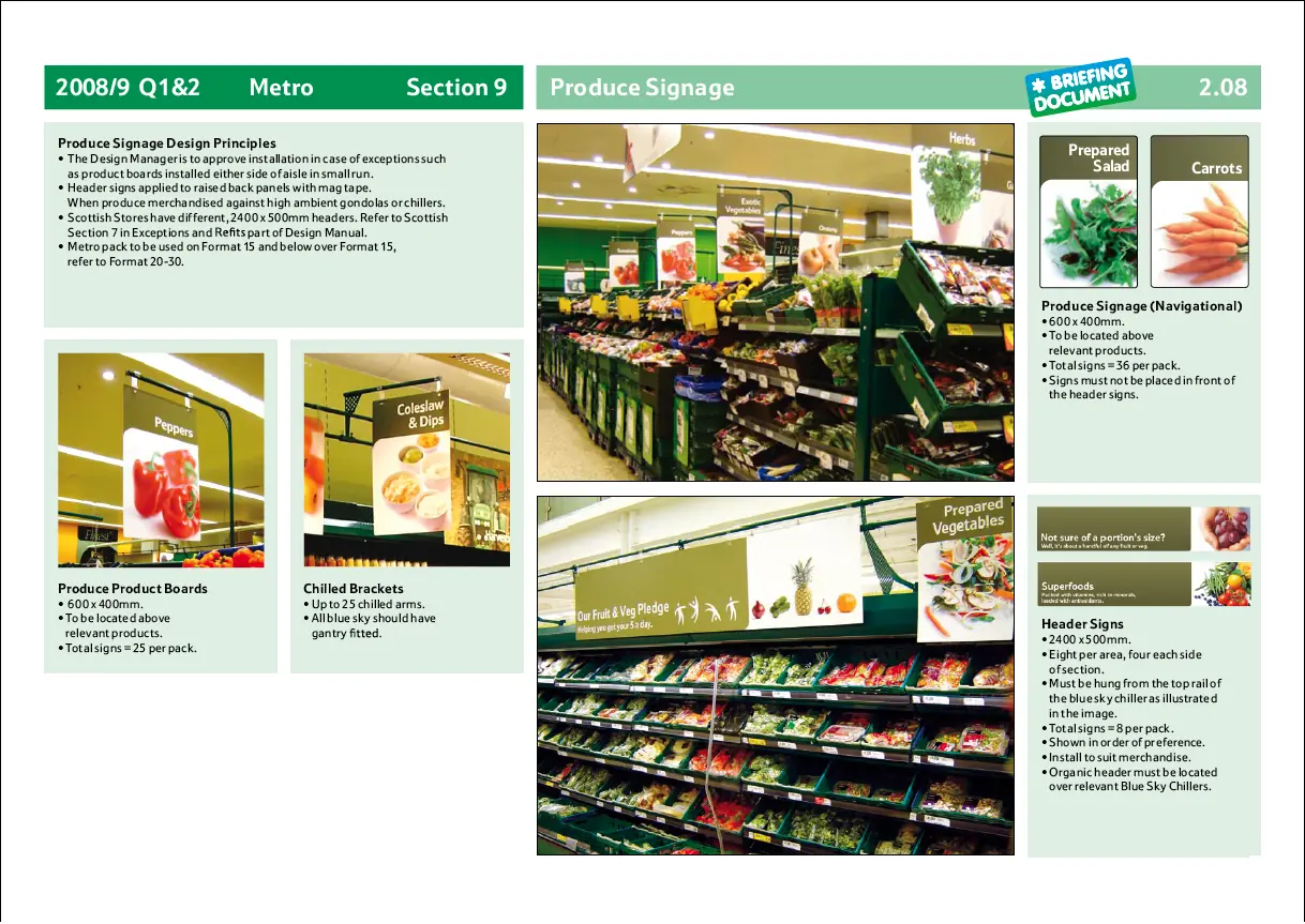
Tesco has several retail formats e.g. express, petrol, each with different design specs that may or may not share assets, of which there are thousands.
The previous manual was A5, thick, and had diagrams and text which were too small to read.
Solution
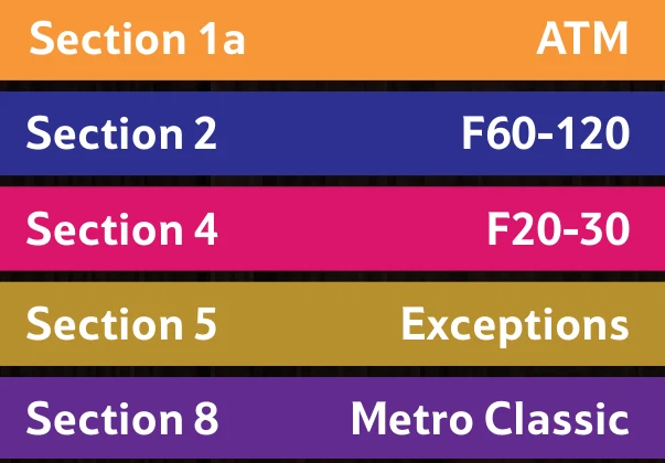
A colour-coded, modular design system that scales across the business, so store design managers could find what they need quickly.
Benefits
Faster access to relevant info for store design managers.
Colour-coded, modular structure built to extend across the whole business.
Turning brand elements into a system
Challenge
Codify existing design and develop new brand elements to create a cohesive system that was easy to use.
Solutions
We investigated the history and idea behind current elements to coalesce the look and feel.
Consulted the design team and involved them in building a system that worked well and was easy to apply.
Benefits
A unified logo, colour and font system.
Content and messaging aligned to the brand.
Flexible layouts, built for reuse.
Agency for the design team.

About me
I’ve designed letterforms and logos since I was a kid.
My background is in editorial and print; editing and designing papers and magazines.
I also worked on the ft.com news desk, contracted at many agencies and DJed professionally for 30 years.
What I’ve learnt in the last 25 years in branding and design has now been coalesced into one idea, Brand Services.
A few years ago I was diagnosed with ADHD. It reframed how I naturally understand systems and spot inconsistencies.
It’s been great for the work I do and probably why I do it. It allows me to provide practical solutions.
Testimonials
“If you are after someone who will get the job done without beating around the bush, Rob is that person. He understands brands and what makes them work and what doesn’t. He focuses in on what needs to be done and puts measures in place to ensure things are completed whilst eliminating other unnecessary distractions.”
Steve RandoLa Trobe University
Creative, Brand and Studio Manager
“Rob’s attention to detail is second to none - exactly what you require when preparing Corporate/Retail brand guidelines. He is thorough and precise with all of his work. A breathe of fresh air to see someone take pride in the delivery and present it in a constructive, positive manner.
Great sense of humour and a pleasure to work with. I will definitely be working with Rob again.”
Jinx JeffreyCreative Services Manager
Get in touch
I’m a sole trader and can work
inside or outside IR35.

Hello. I’m an Australian in London and I have three loves: music, design and airline branding. I grew up under a flight path and learned to recognise planes and airlines.
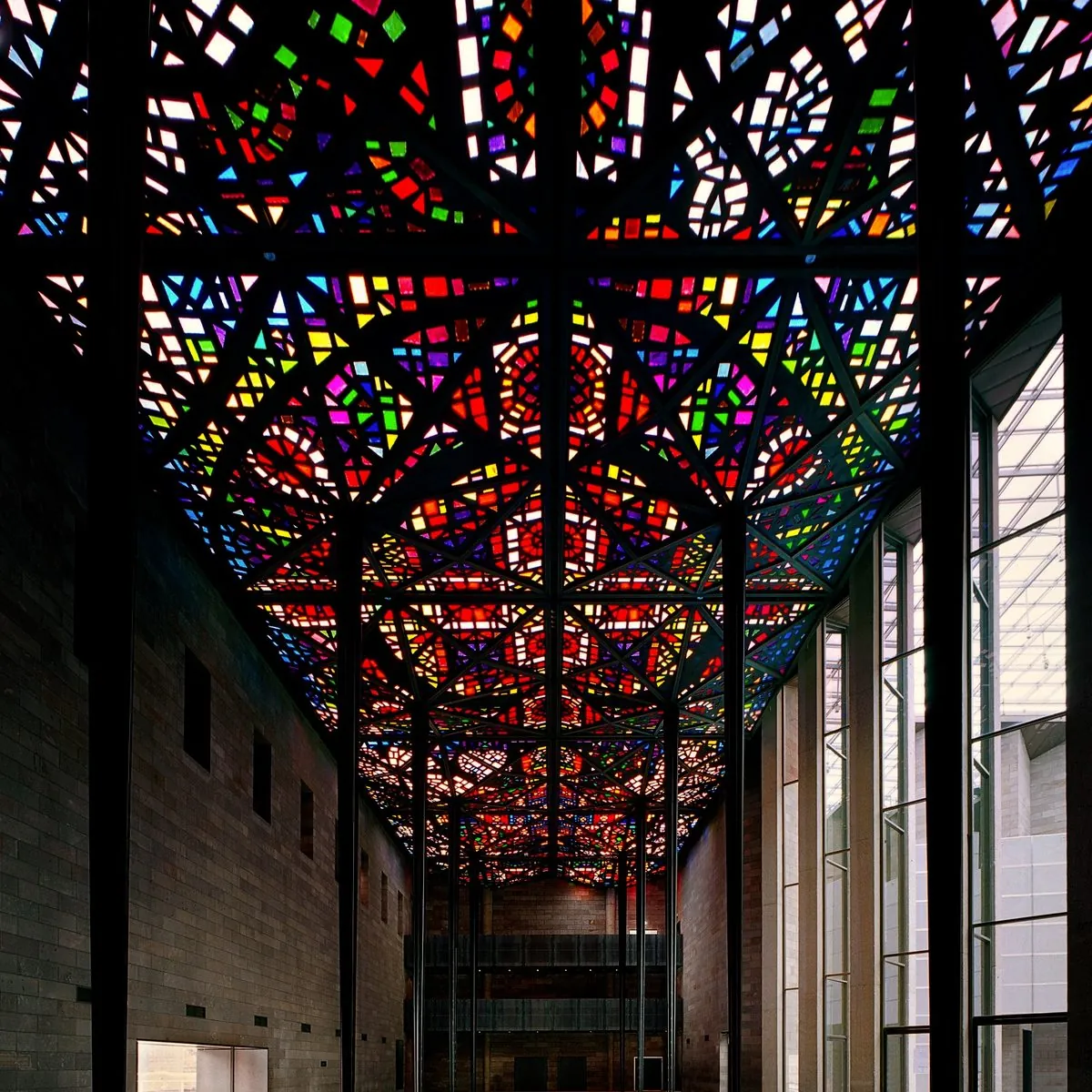
I love vivid colour and transparency. Leonard French’s stained glass ceiling at the National Gallery is an early and enduring influence.
I DJed for 30 years and was a resident at Purveyors in Melbourne, and at Magic Bus at London’s legendary Blue Note. Dancing is freedom. DJing gives me satisfaction. I make music and remix other people’s.
I came to London to work for Acid Jazz Records and was at The Financial Times for a couple of years after. Although I’d been designing things since I was a child it was only after this I went professional, working for Kerrang!, Tesco then agency land.
I was diagnosed with ADHD in 2024; a surprise to no one but me. Now I know why I recognise patterns others may not and understand systems easily. It’s useful in my work. This article talks about how ADHD brains are structured differently.
ADHD means I might miss social cues, interpret situations differently and understand the world differently. I’m grateful to have people around me who understand this.
Mensa invited me to join; which was nice.
rTMS and medication have enabled me to break a very long cycle of depression. It feels as though a cloud has finally lifted. Onward!